Spendive
Spend smarter, work faster, save bigger: spend & procurement management for growing teams
Overview
Spendive is a spend and procurement management platform for startups, SMEs and mid-sized companies. It brings procurement, reimbursements, approvals and vendor management into one place, giving finance teams structure, control and visibility over every naira spent. As the sole product designer, I led the web app and the marketing website, improving the visual design, UX and navigation to match the company’s new direction.
Role
Sole Product Designer
Type
Web app · B2B SaaS
Industry
Fintech · Procurement
Deliverables
Web app, website, mobile approvals
Users
Admins, employees, vendors
The challenge
Growing businesses manage procurement and expenses across spreadsheets, chats and slow manual approvals. The result is little visibility, weak policy compliance, delayed reimbursements and poor collaboration with vendors, which leads to budget overruns and operational drag. Spendive needed one platform that felt simple enough for any employee, yet powerful enough for finance teams.


The solution
One platform for the full spend lifecycle
Spendive automates spend from request to reconciliation, accessible on web and optimised for both finance professionals and non-technical employees.
Smart request-to-approval flows with multi-level approvers
Spend visibility and forecasting across teams and departments
Easy reimbursements with built-in policy checks
Vendor engagement tools and a marketplace
Built-in policy logic and audit trails for compliance
Visual language
The refreshed brand leans on a bright, confident blue for trust and action, clean neutral surfaces for dense financial data, Figtree for friendly legibility and a consistent icon set across every module.

Onboarding
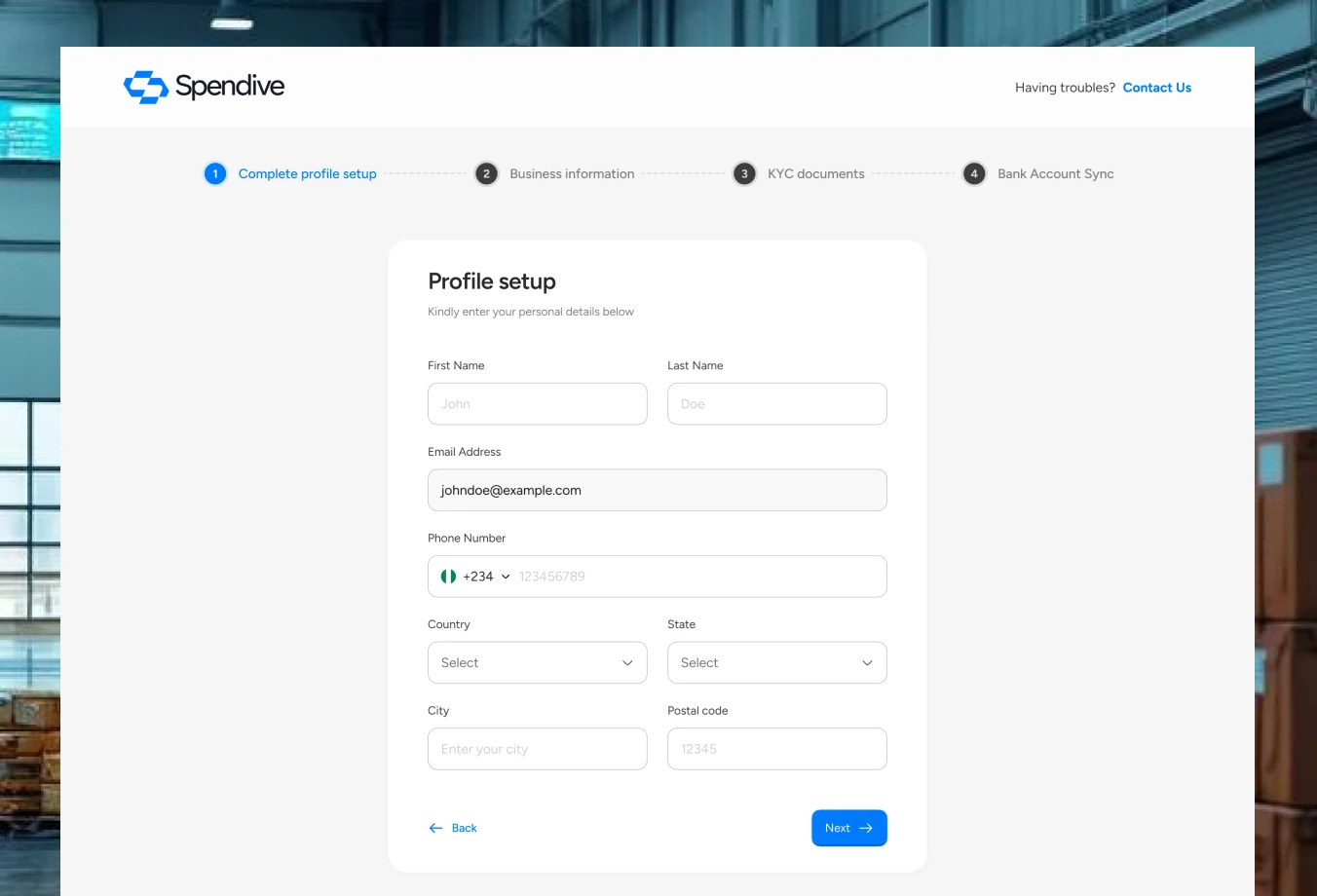
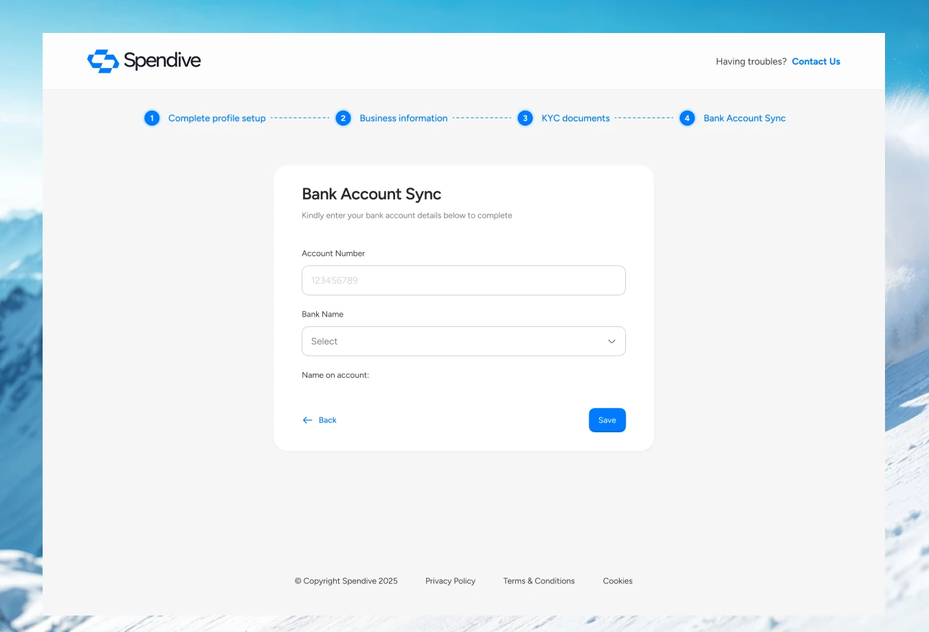
Onboarding had to get a company from sign-up to a working account without a sales call.
Sign-up, profile completion and bank sync are split into short, focused steps with clear progress.
Bank account sync comes last, once trust is established, so drop-off stays low.
Admin & employee dashboards
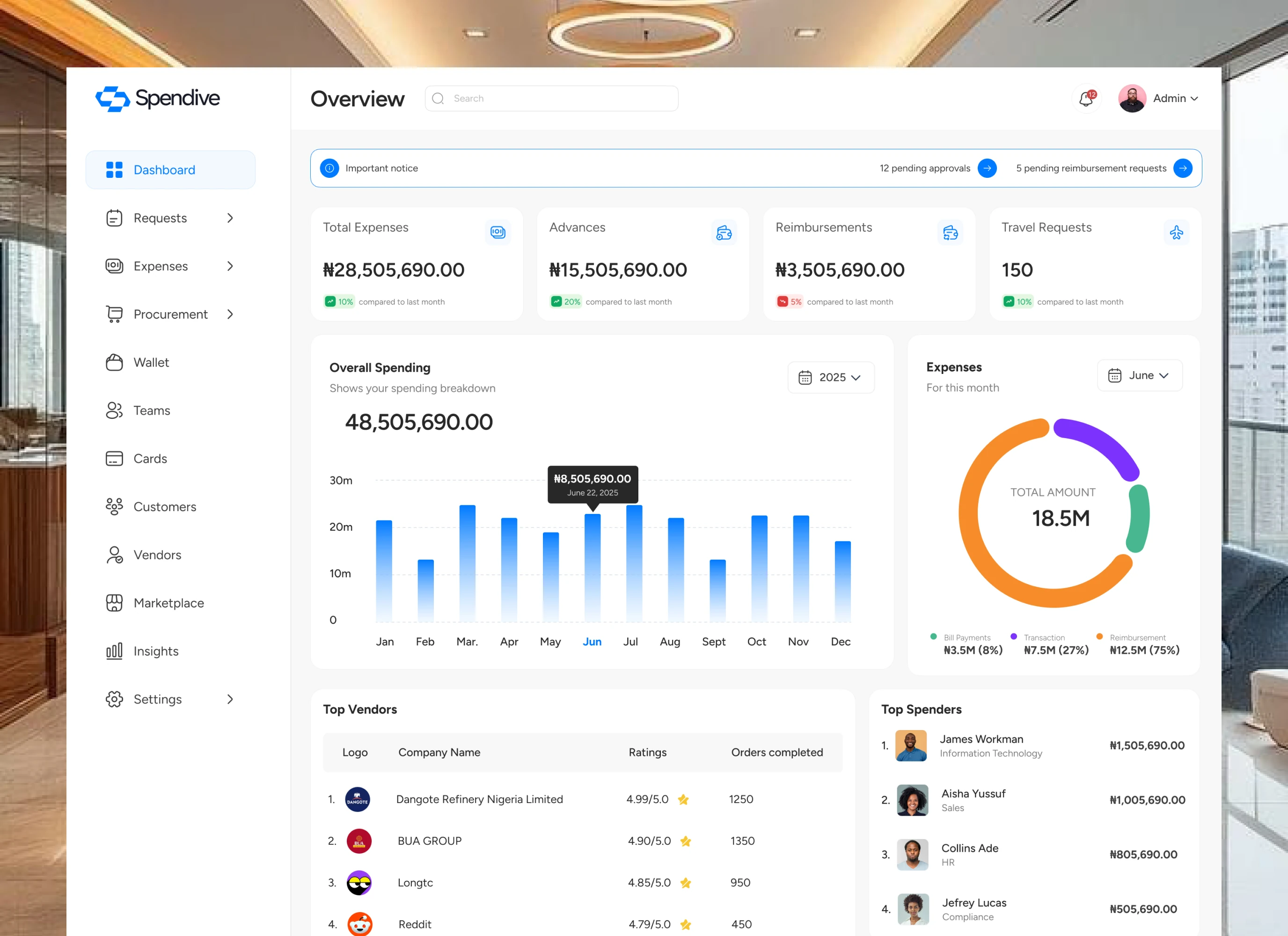
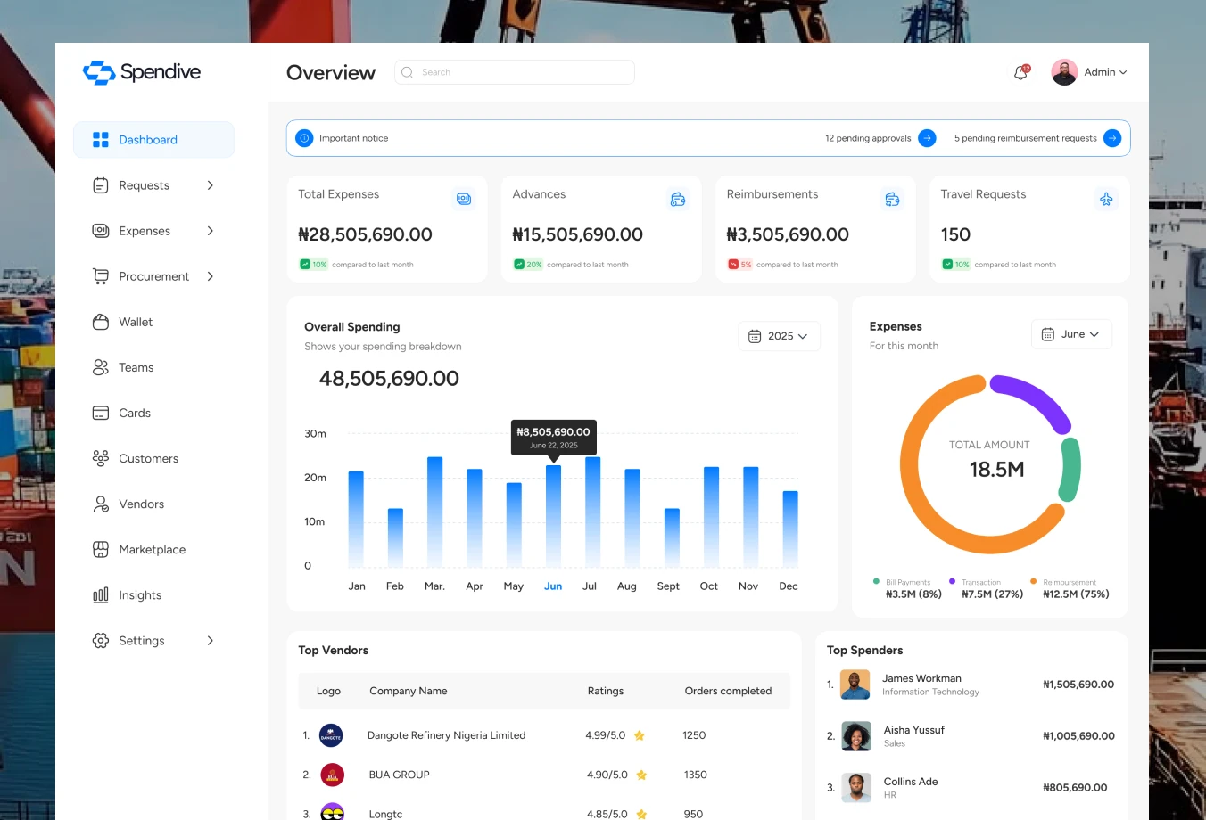
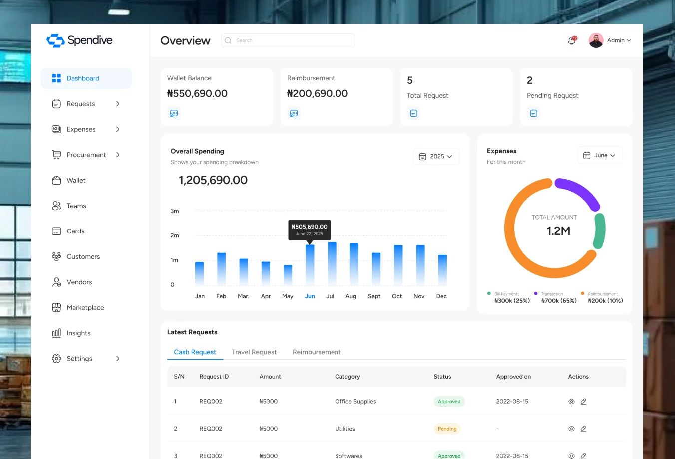
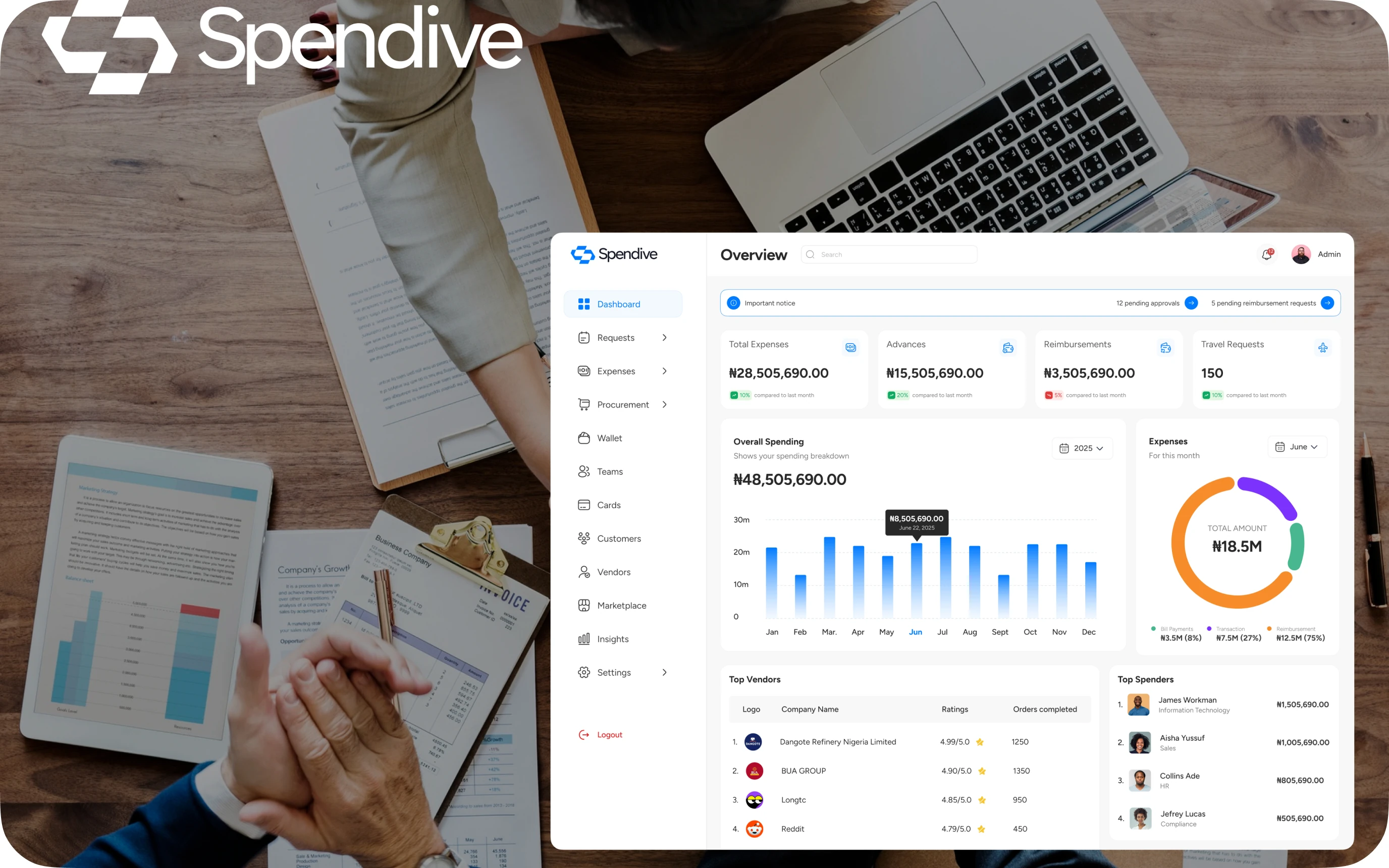
Admins need an organisation-wide picture; employees just need to know where their requests stand. The two dashboards share one structure but surface different data.
Admins see total expenses, advances, reimbursements and travel requests, plus pending approvals, top vendors and top spenders.
Employees get a personal request history covering cash, travel and reimbursements, with status at a glance.
An important-notice bar keeps pending approvals one click away.
Spend controls
Approval workflows that match how companies work
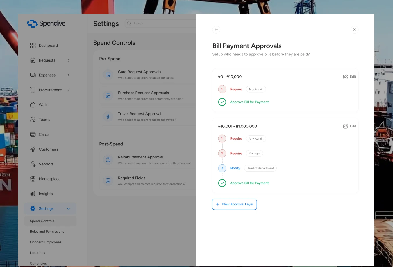
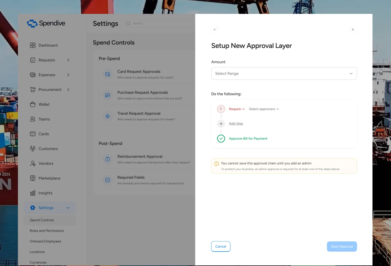
From settings, admins decide who approves what, for cards, payments, travel and reimbursements, with multiple approval layers and notifications at each step.
Each control is phrased as a plain question, like “Who needs to approve bills before they are paid?”
At least one admin approval is enforced, with an inline explanation instead of a cryptic error.
Purchase, reimbursement & travel requests
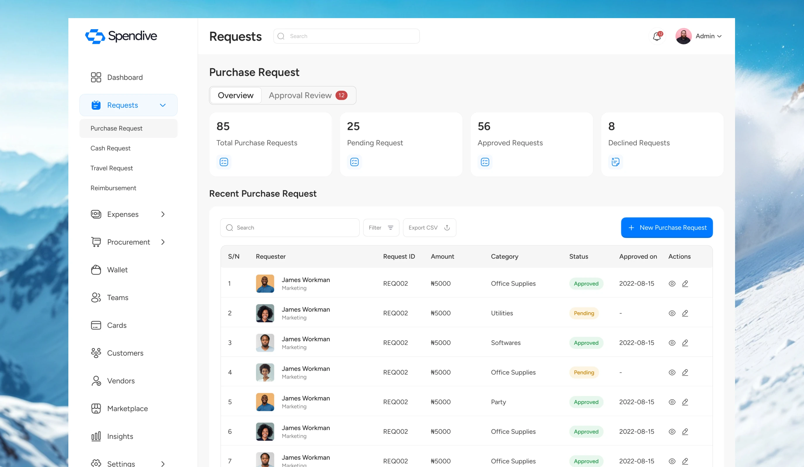
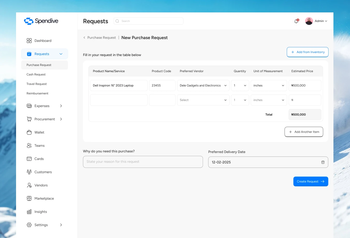
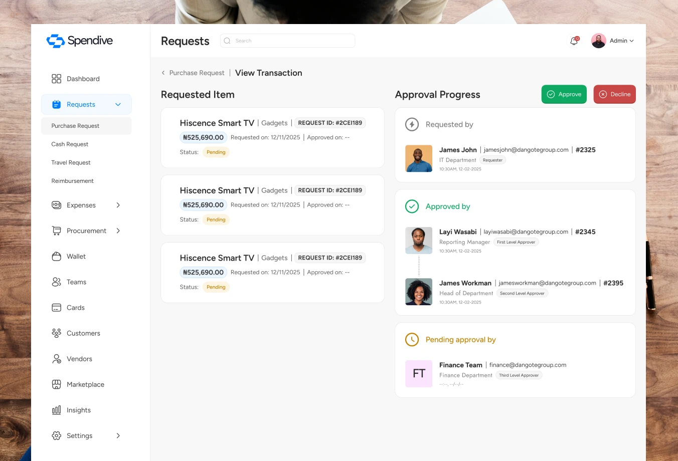
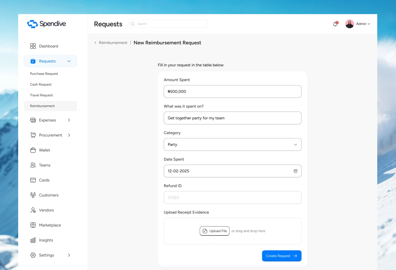
Purchase, cash, reimbursement and travel requests share one consistent flow: create, attach proof, route for approval, track status. Learn it once and it works everywhere.
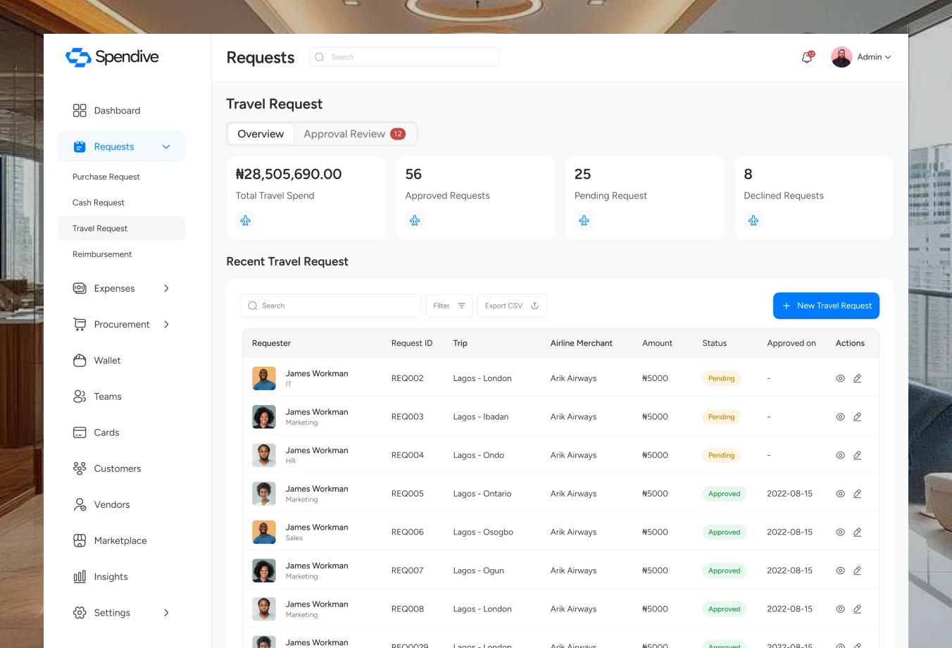
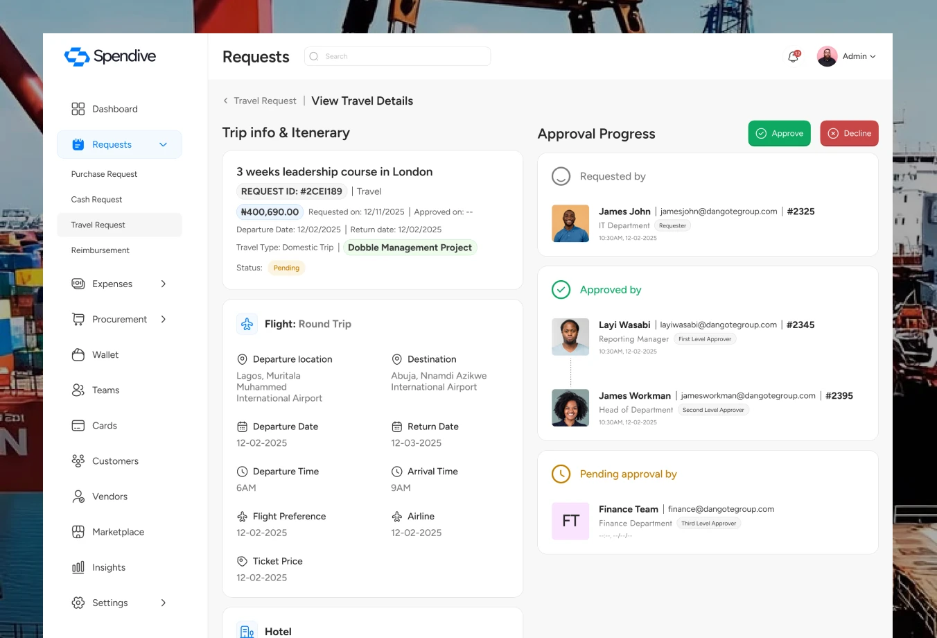
Users see only their own requests; admins and managers get an approval review tab.
Status indicators appear at every approval stage after testing showed people lost track of where requests were.
Forms were simplified after testing to reduce complexity and abandonment.

Travel requests
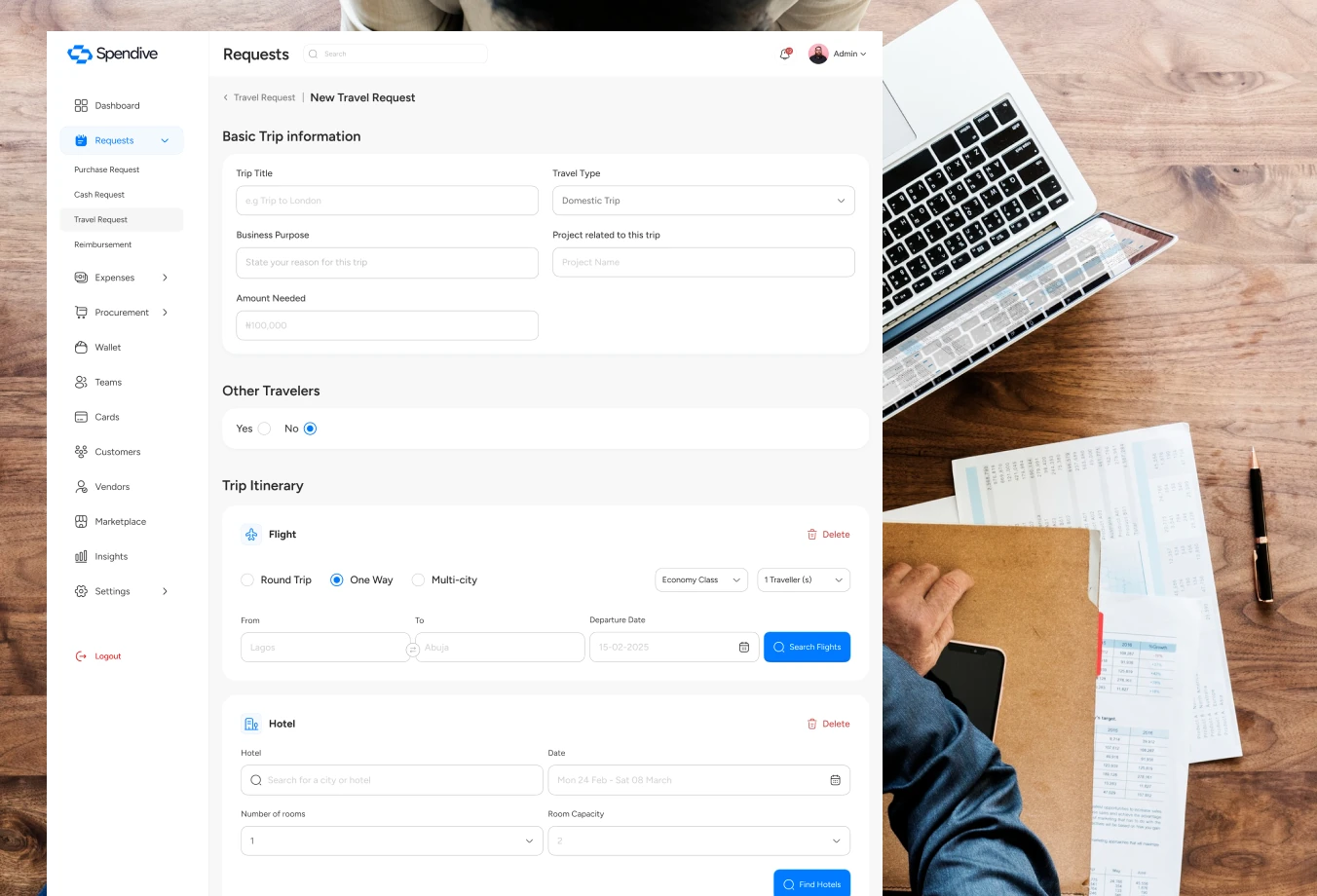
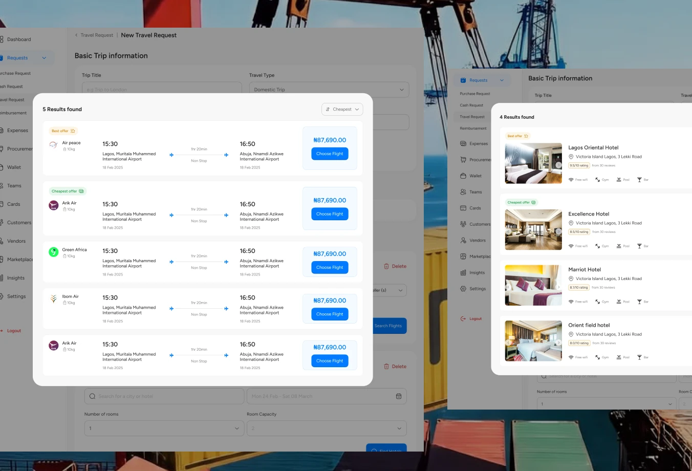
Travel is the most detailed request type, so the flow breaks it into clear, guided steps, from trip details through to cost estimate and review.
Trip details come first, so the rest of the form adapts to the journey.
Costs build up as details are added, so there are no surprises at approval.
Approvers see the full trip and cost breakdown on one screen before deciding.
Cards & wallet
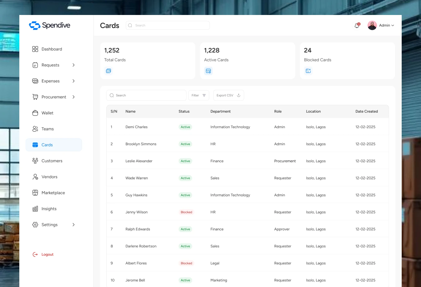
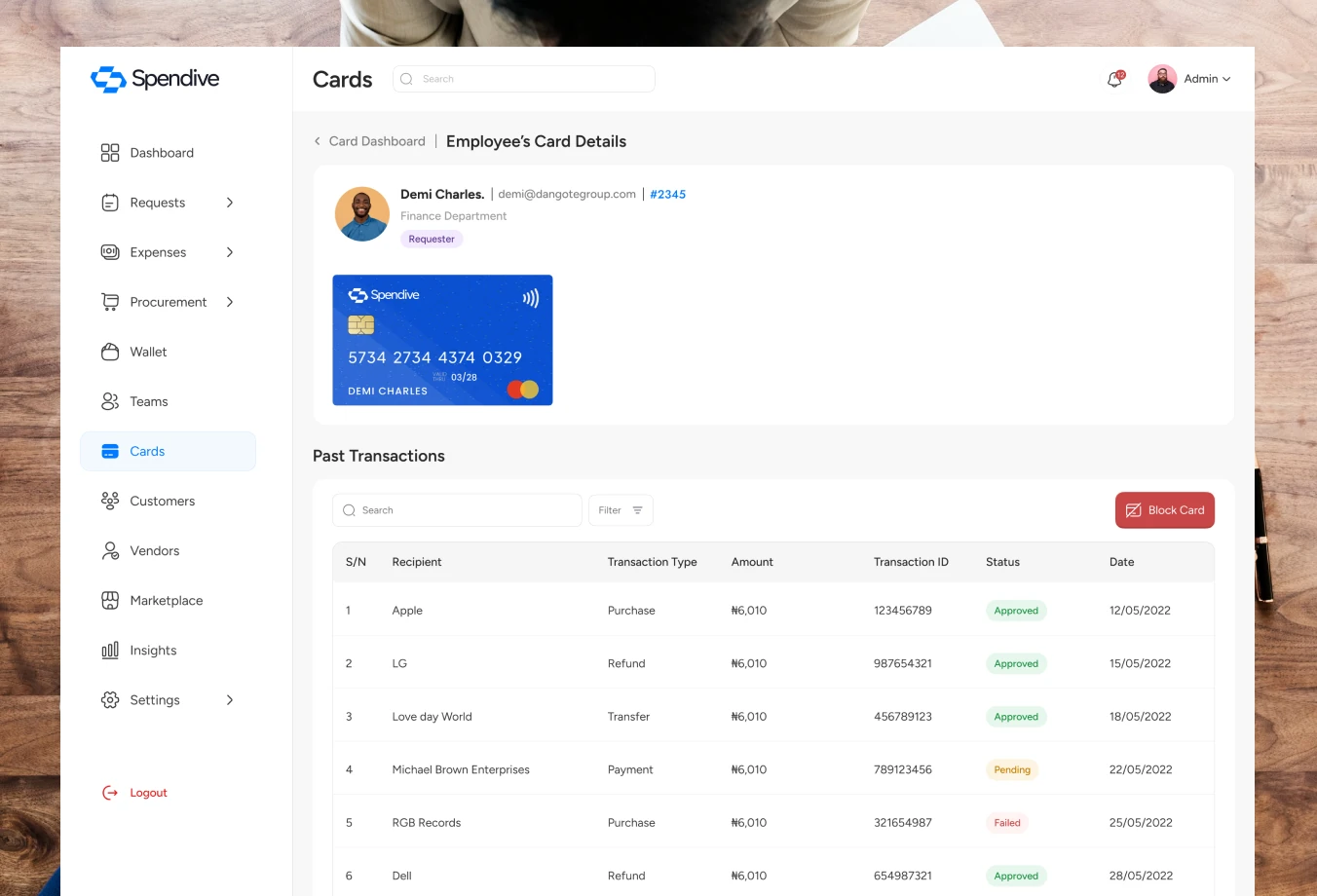
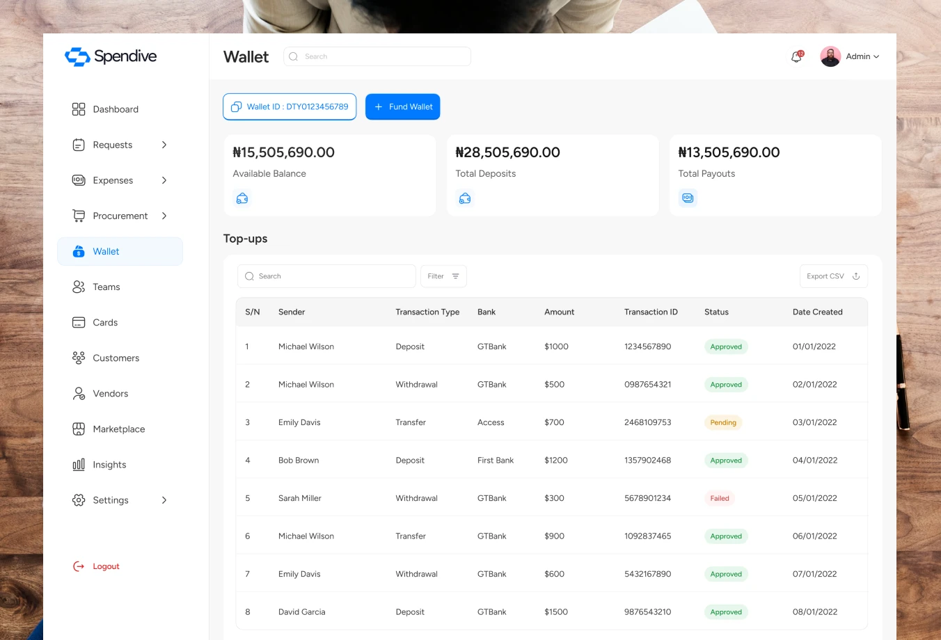
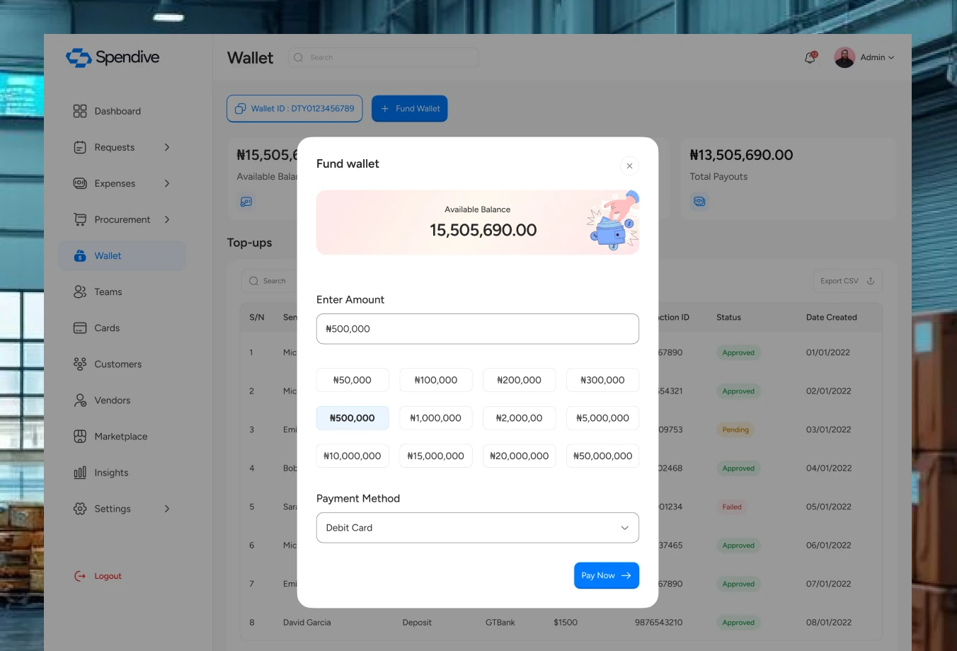
Cards and the wallet give finance teams real-time control over company money, while employees always know what they can spend.
Approved reimbursements land straight in the user’s wallet.
Cards show spend and limits at a glance, so admins can manage them without digging through statements.
The wallet keeps balances, top-ups and transactions in one place.
Budgets
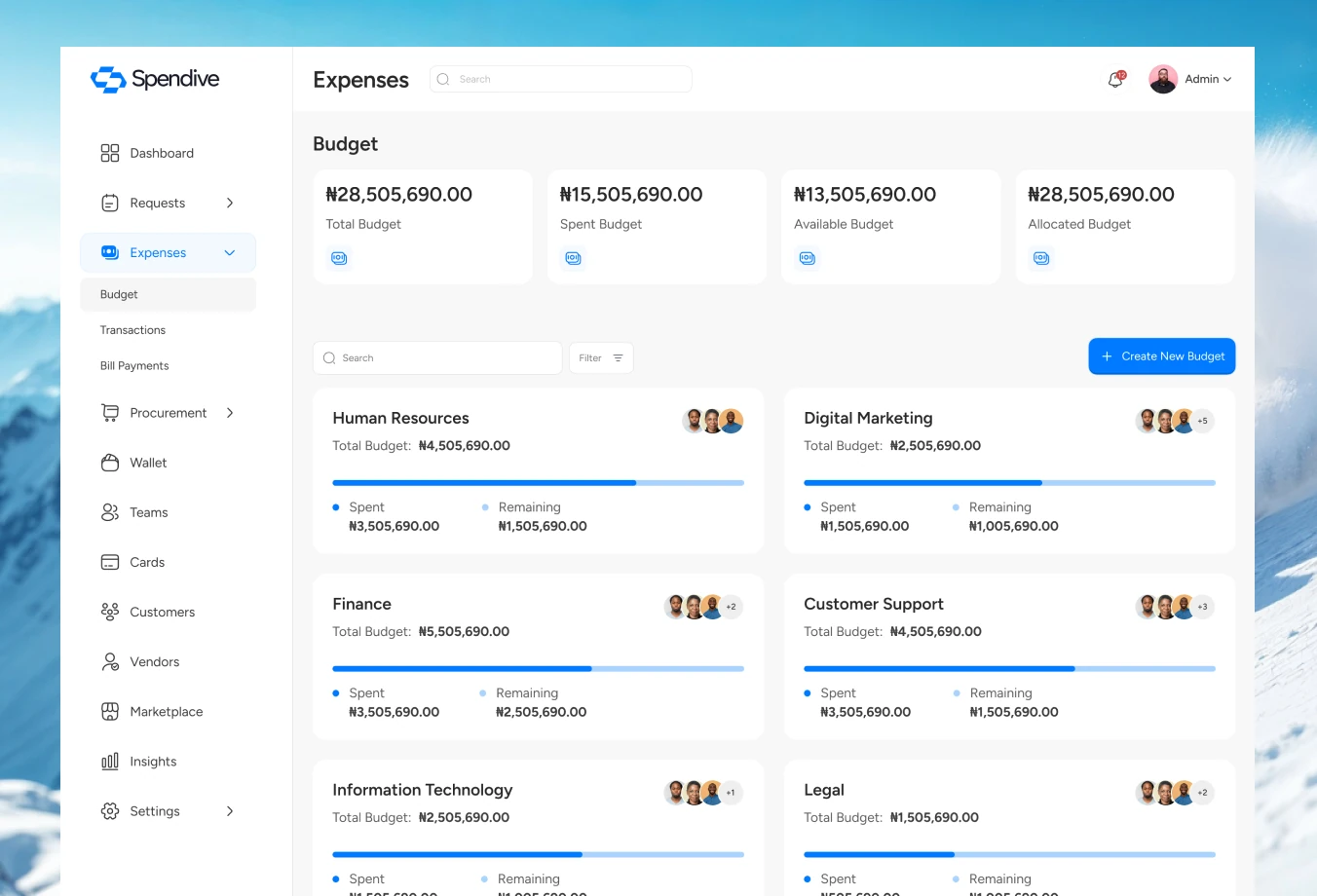
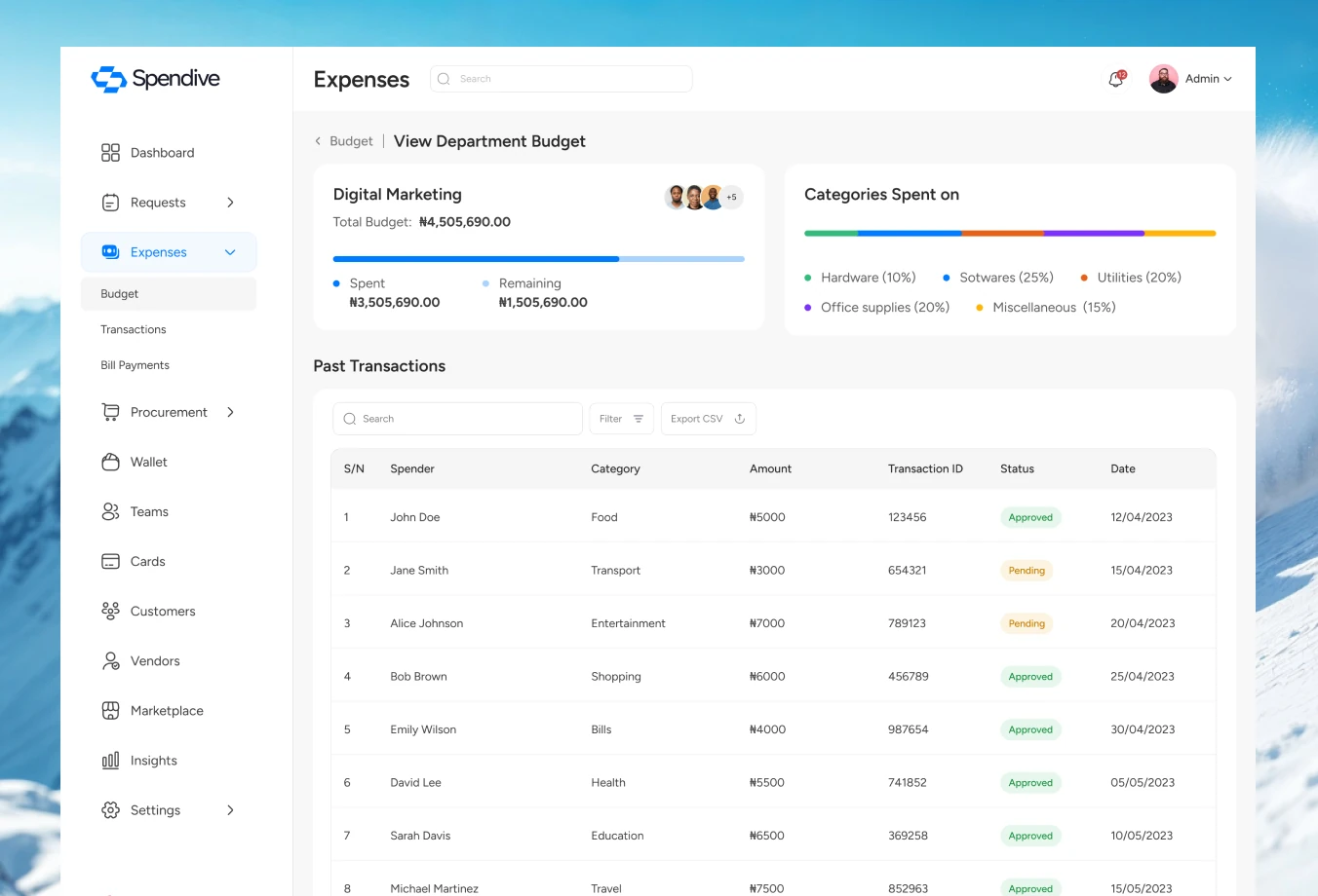
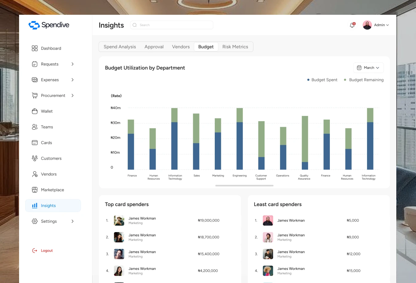
Company and department budgets show what was allocated, what has been spent and what is left, so overspending is visible before it happens.
Transactions & bill payments
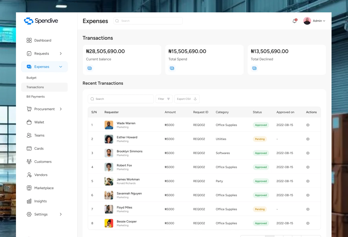
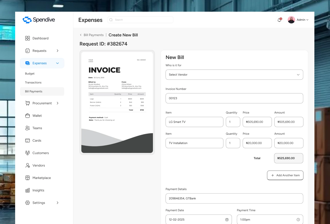
Every naira in and out is traceable, and bills get the same approval rigour as any other request.
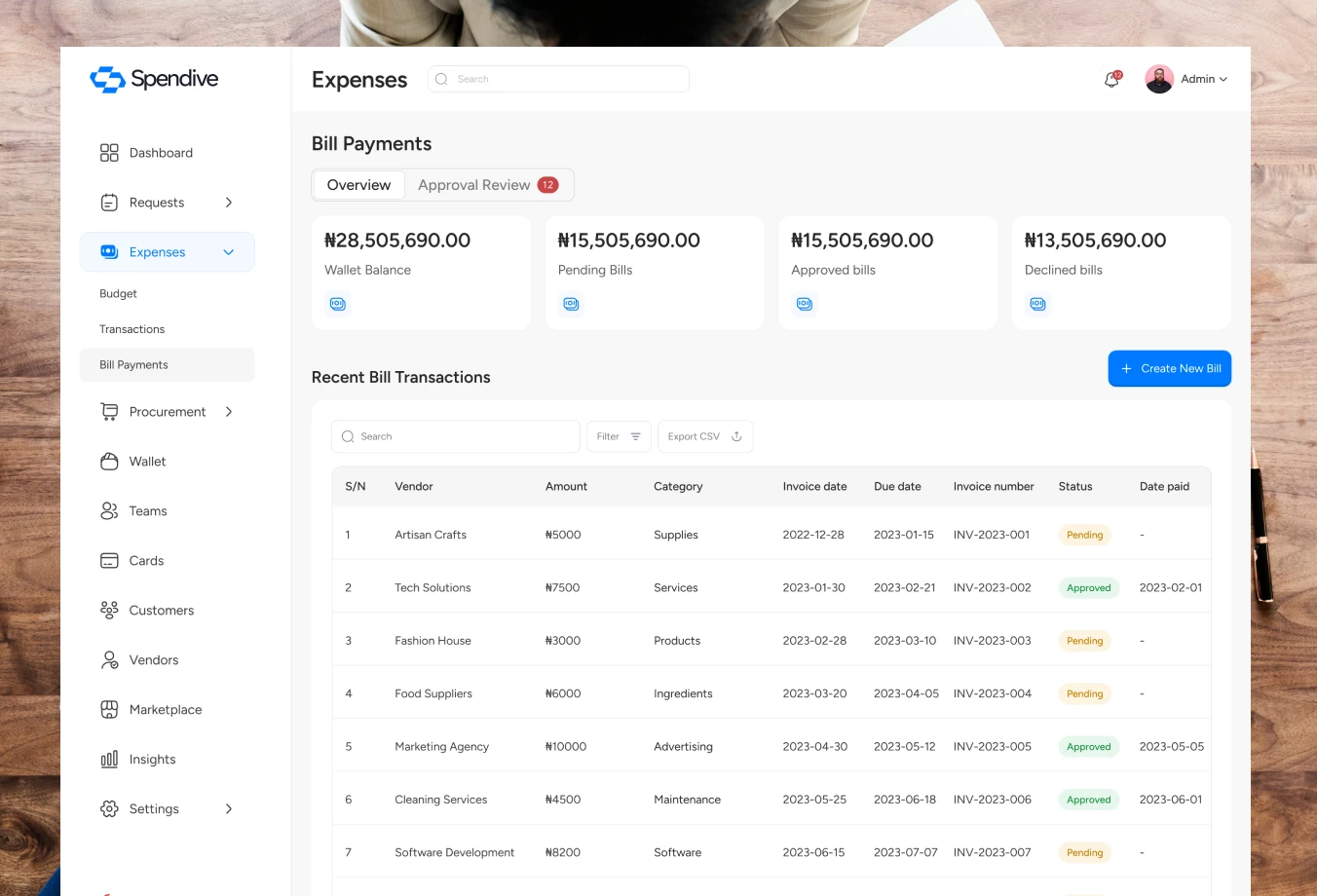
Bill payments show what is upcoming, pending and paid at a glance.
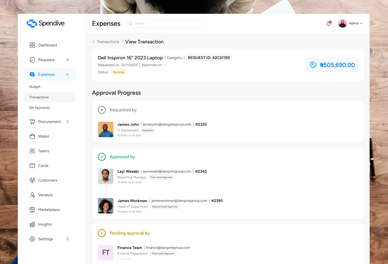
Each bill request carries its documents and approval trail.
Transactions list every movement with status, and pending items open into full detail.
Insights
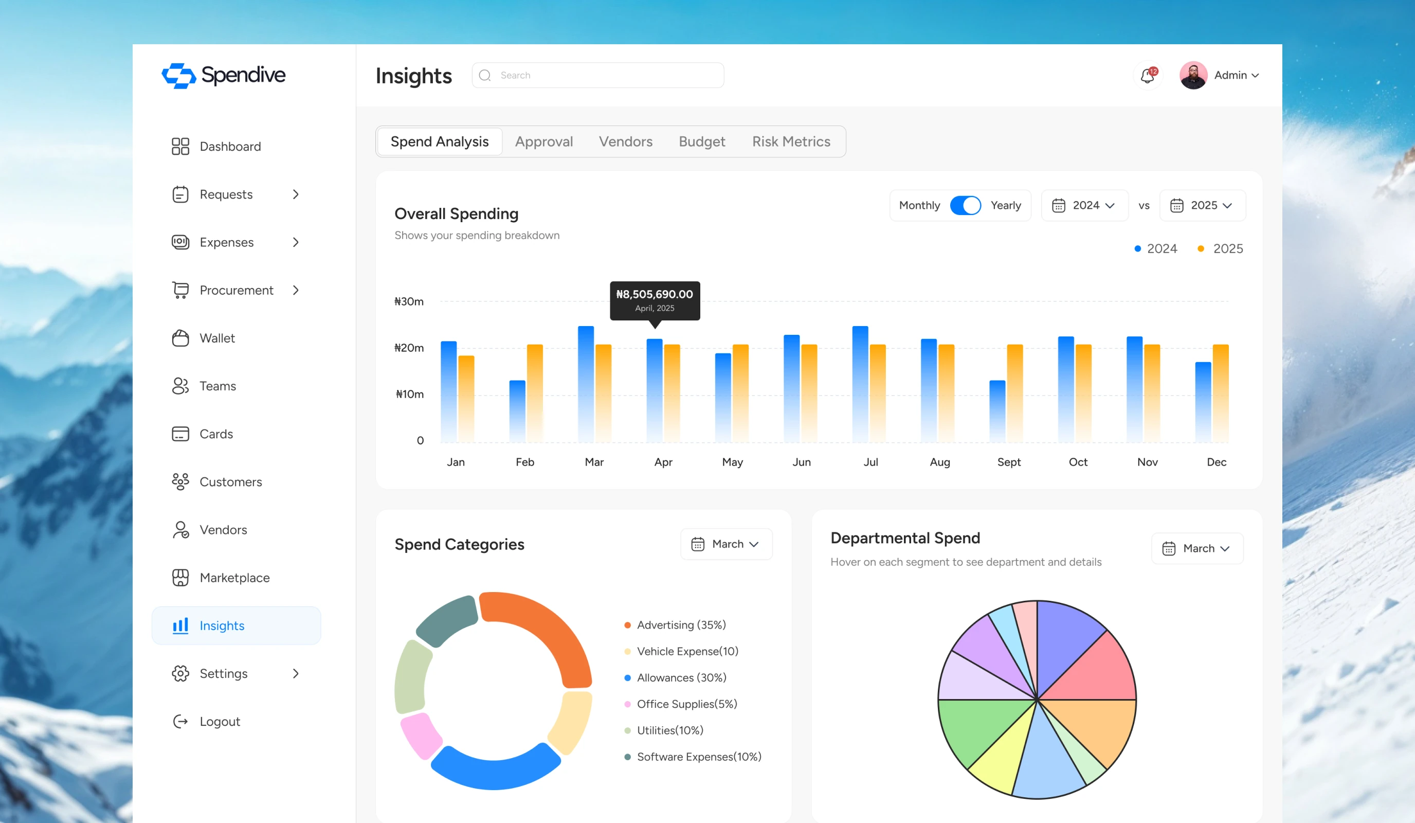
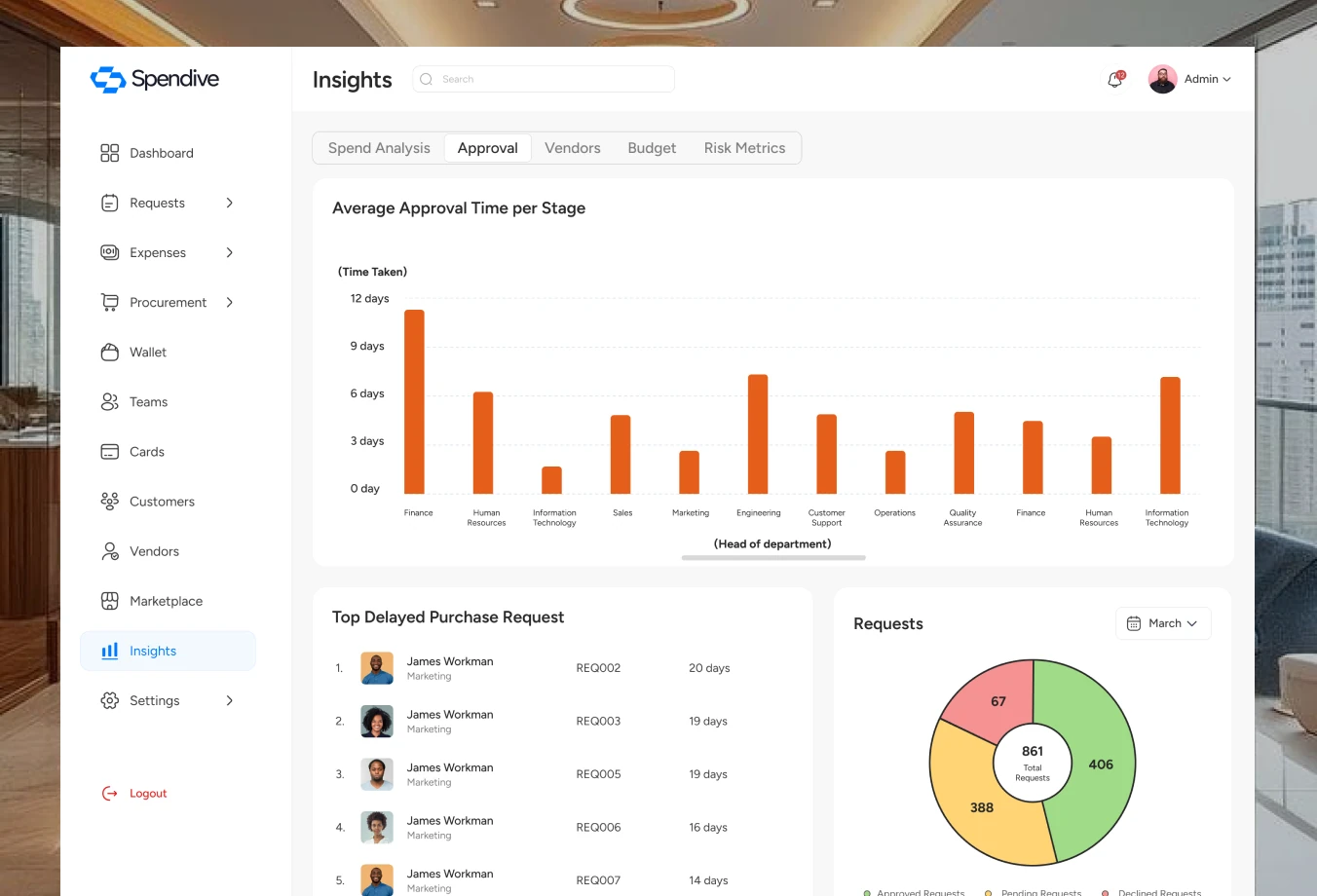
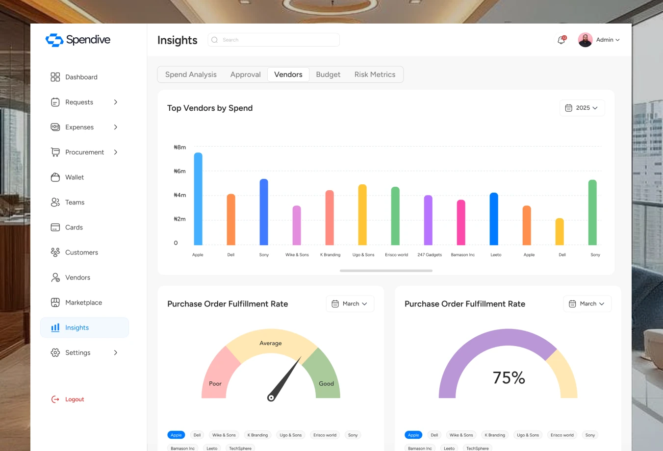
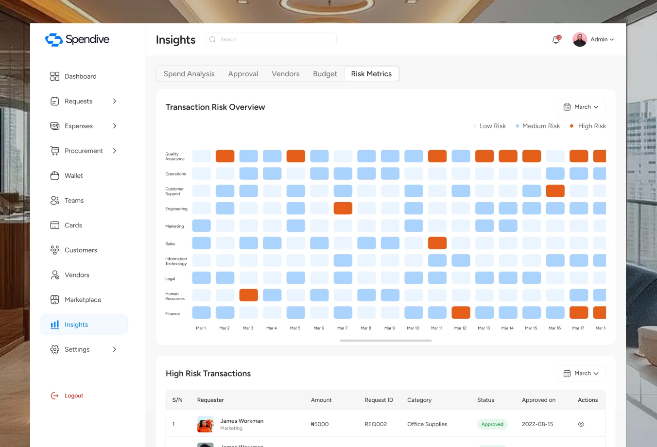
Insights turn spend data into decisions, with dedicated views for spend analysis, approvals, vendors, budgets and risk.
Spend analysis breaks spending down by category, department and time.
Approval insights reveal bottlenecks and turnaround times.
Vendor, budget and risk views flag performance issues and unusual spend early.
Roles, permissions & vendors
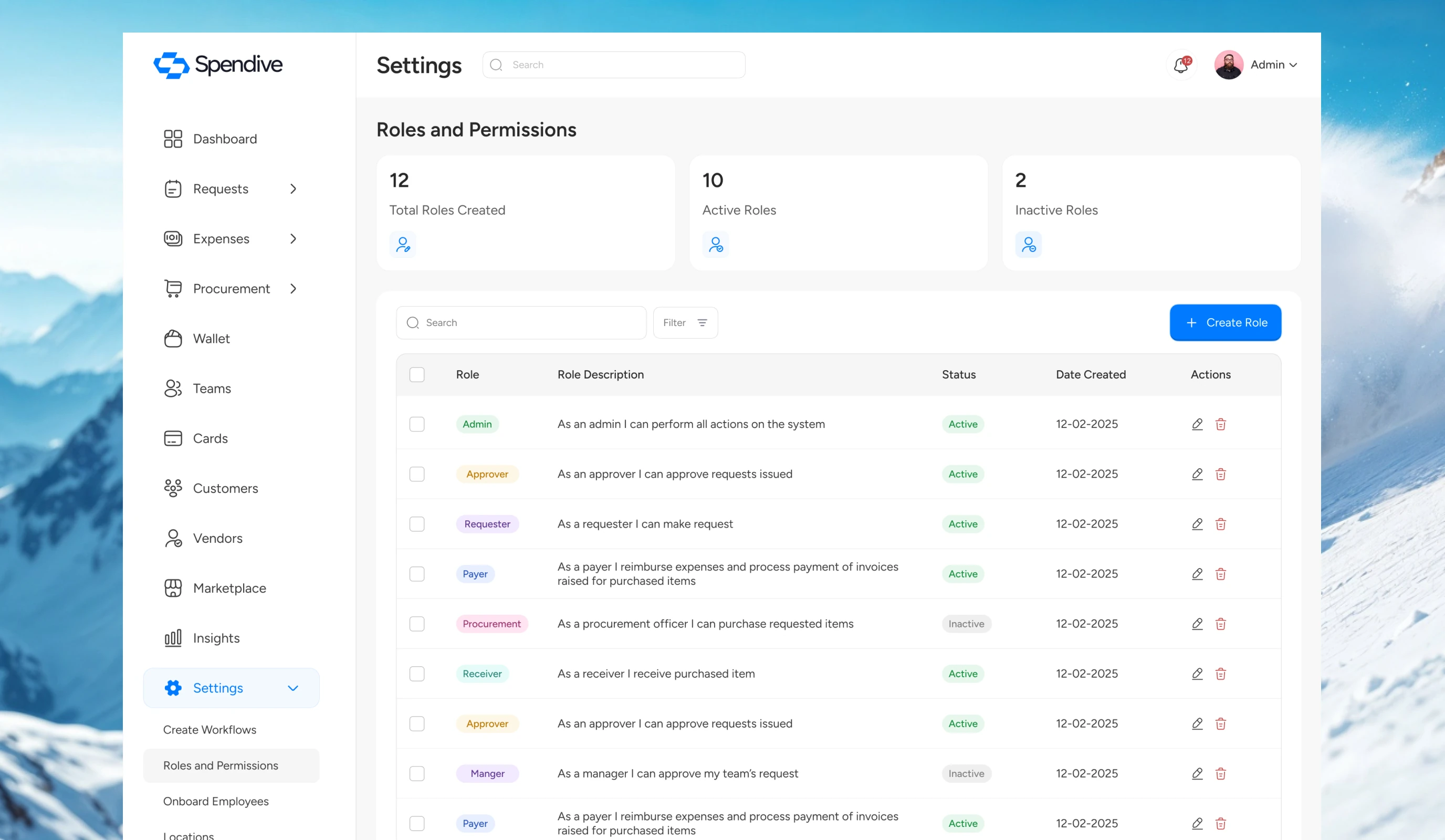
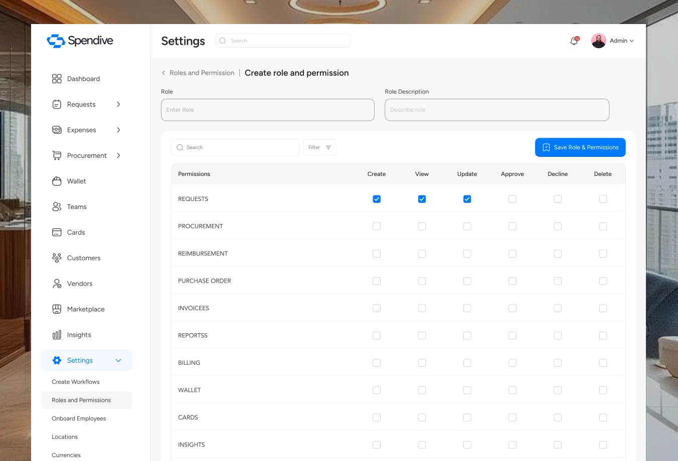
As companies grow, who can do what matters. Role-based permissions and a vendor directory keep spending accountable.
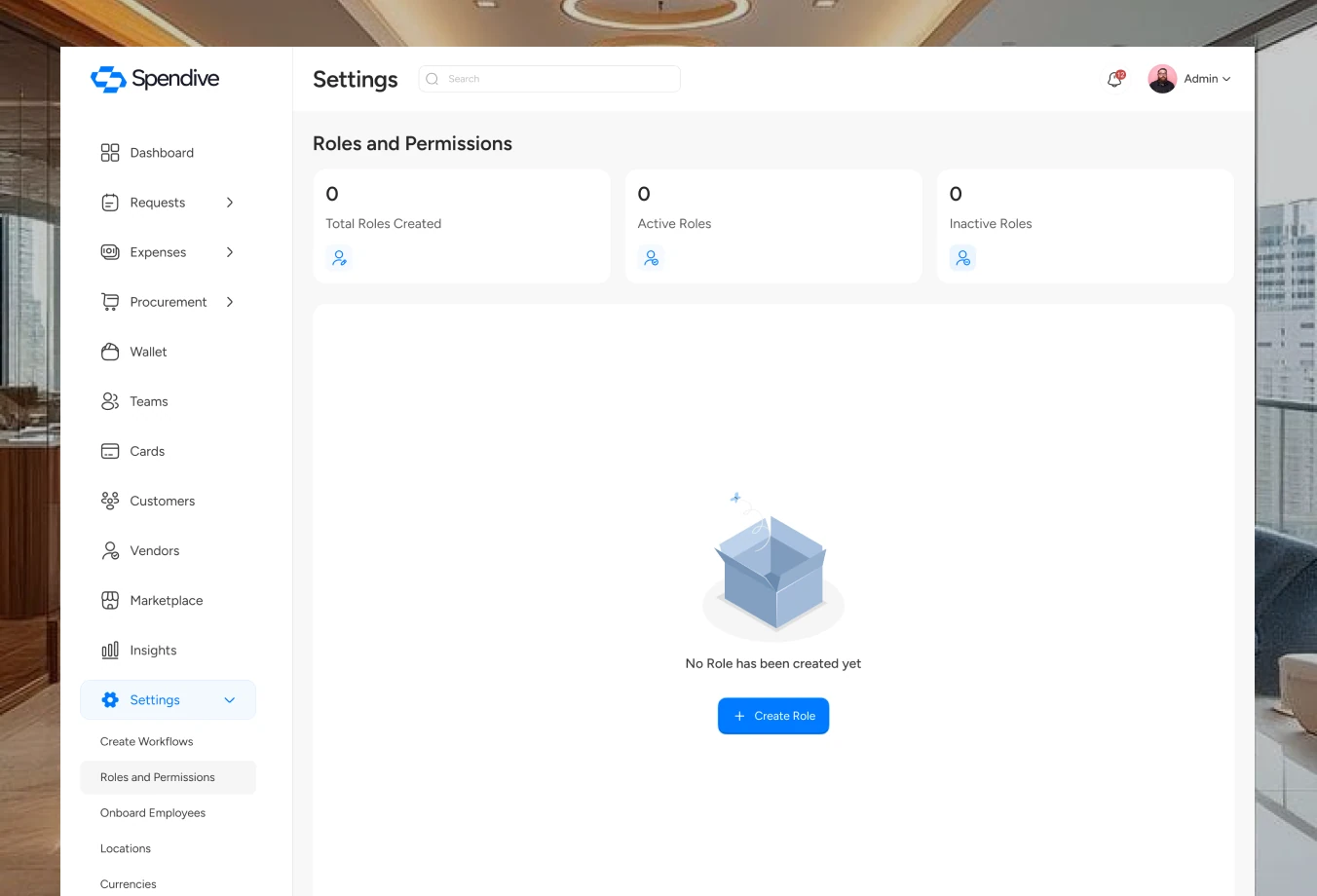
Admins create custom roles with granular permissions instead of one-size-fits-all access.
Vendor profiles bring ratings, orders and documents into one view for faster sourcing.
Teams & employees
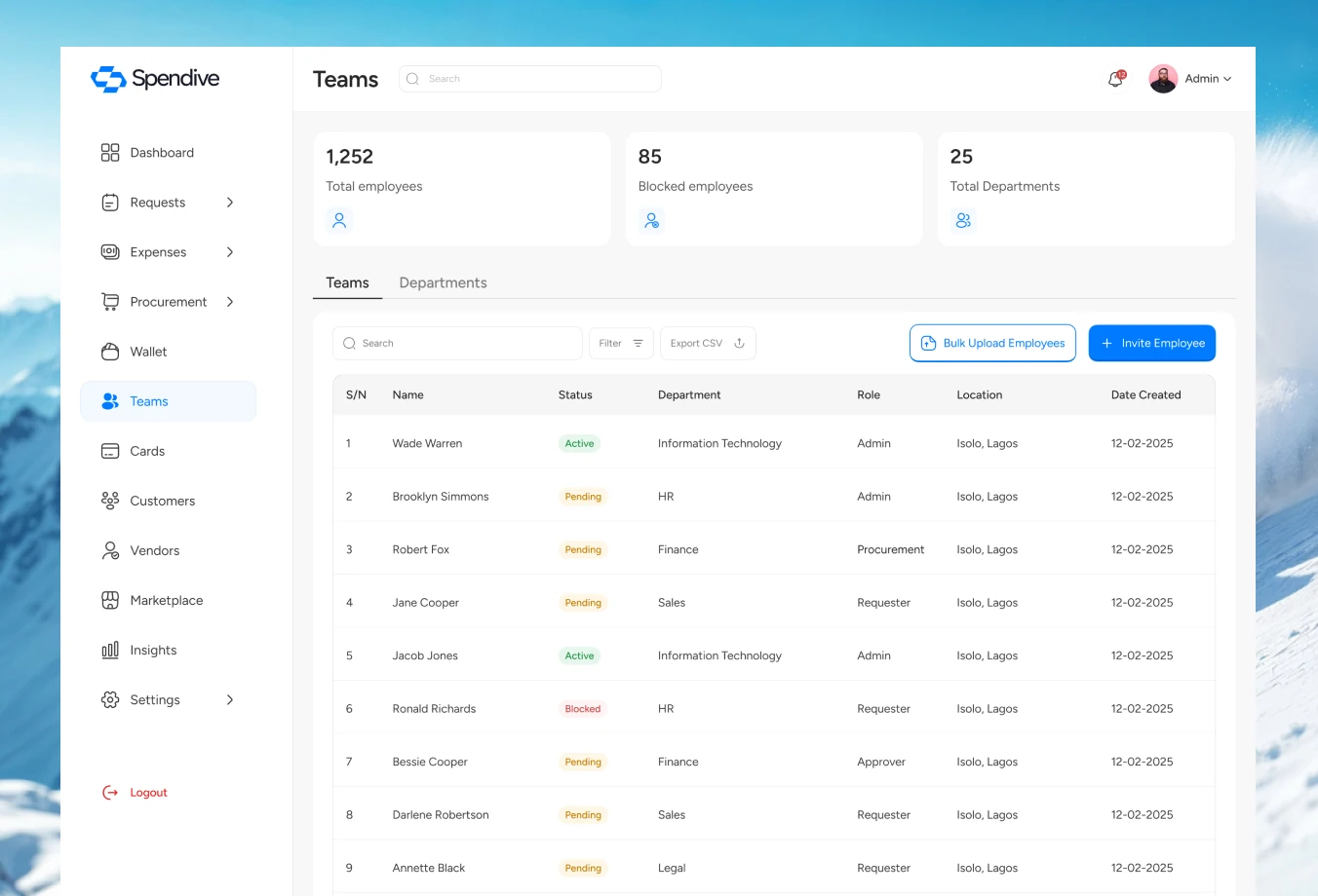
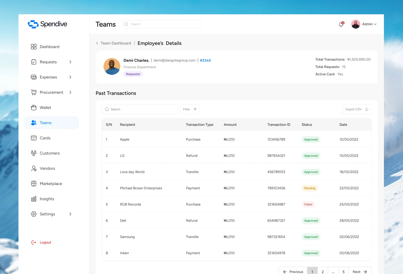
Teams, departments and employees are managed in one place, with single or bulk onboarding for growing companies.
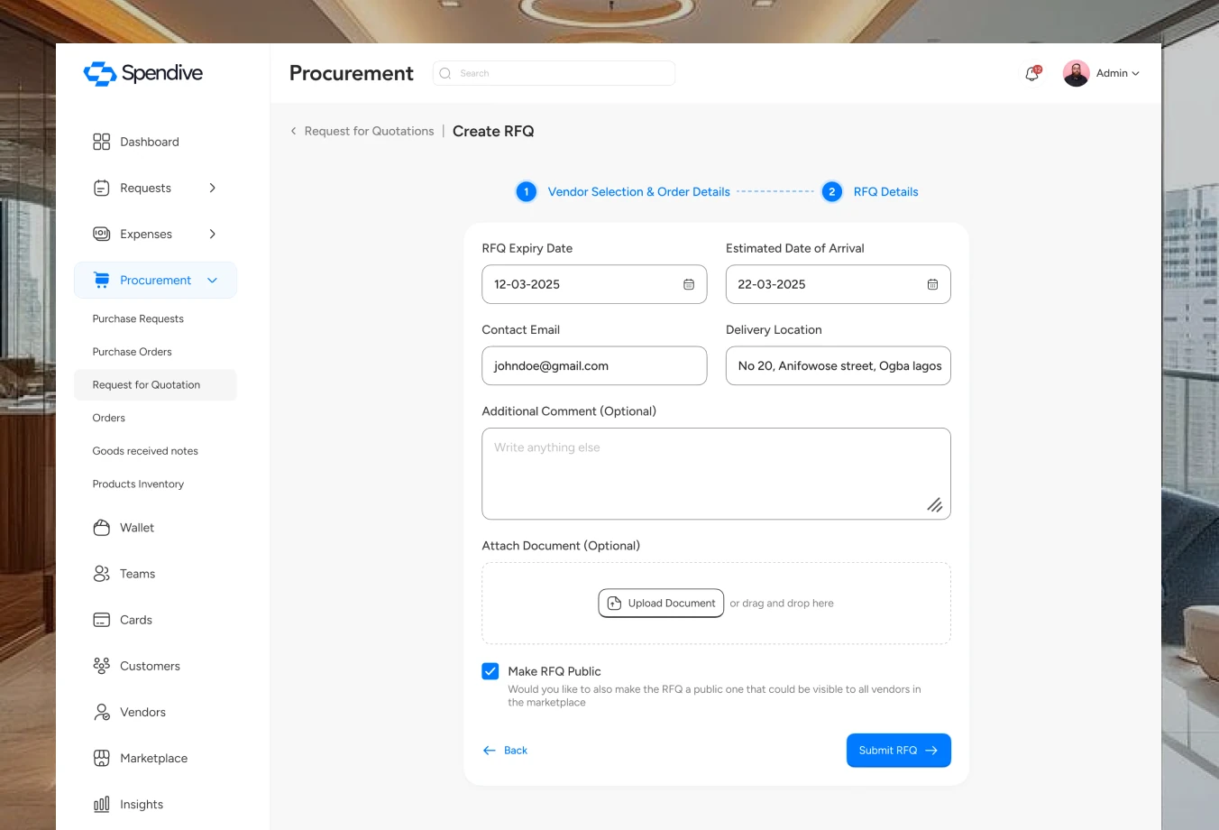
Request for quotation
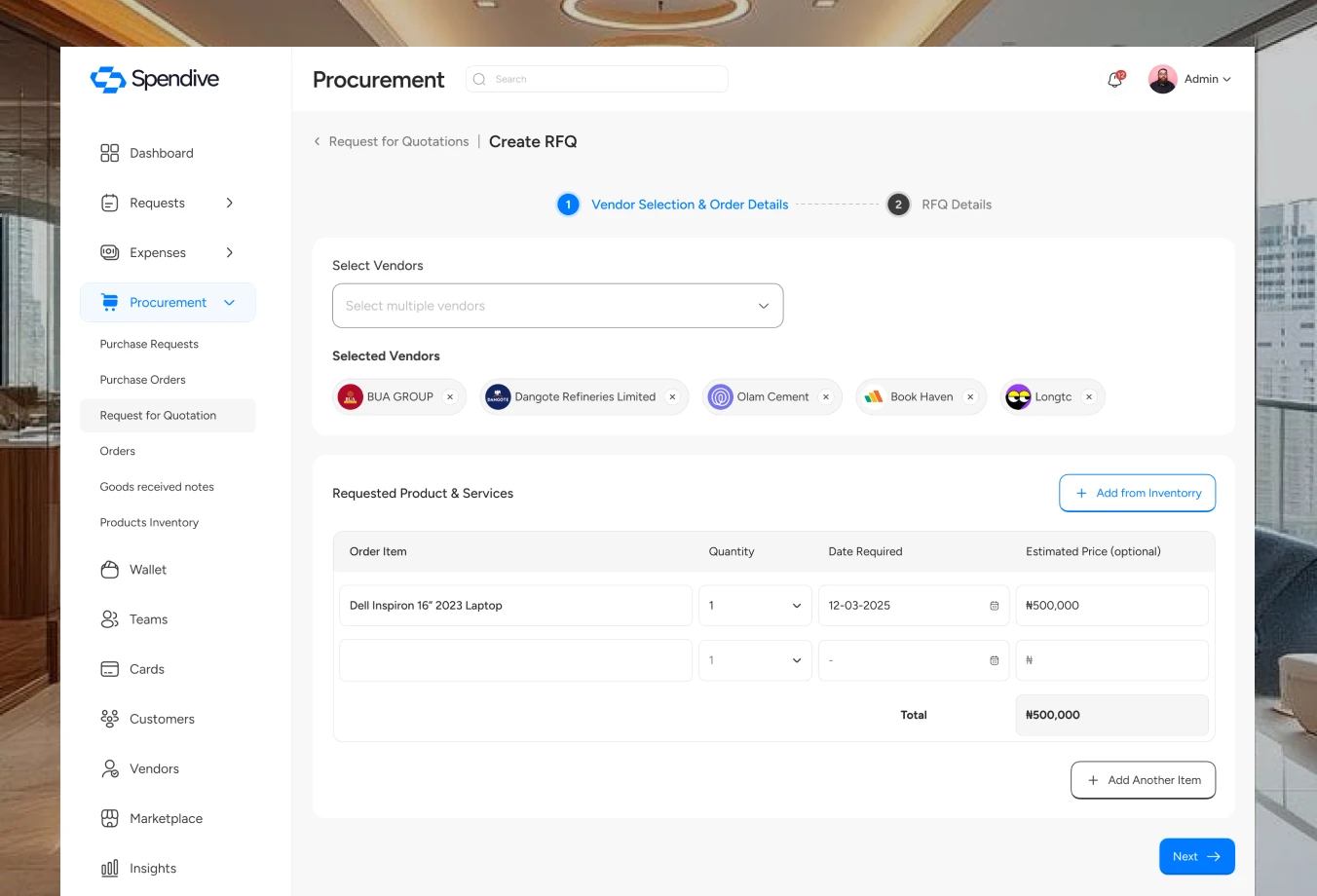
Teams select vendors and send one RFQ to many, so comparing quotes is fair, fast and documented.
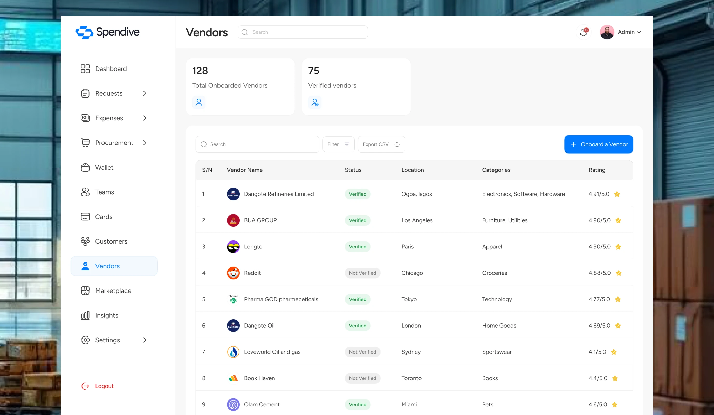
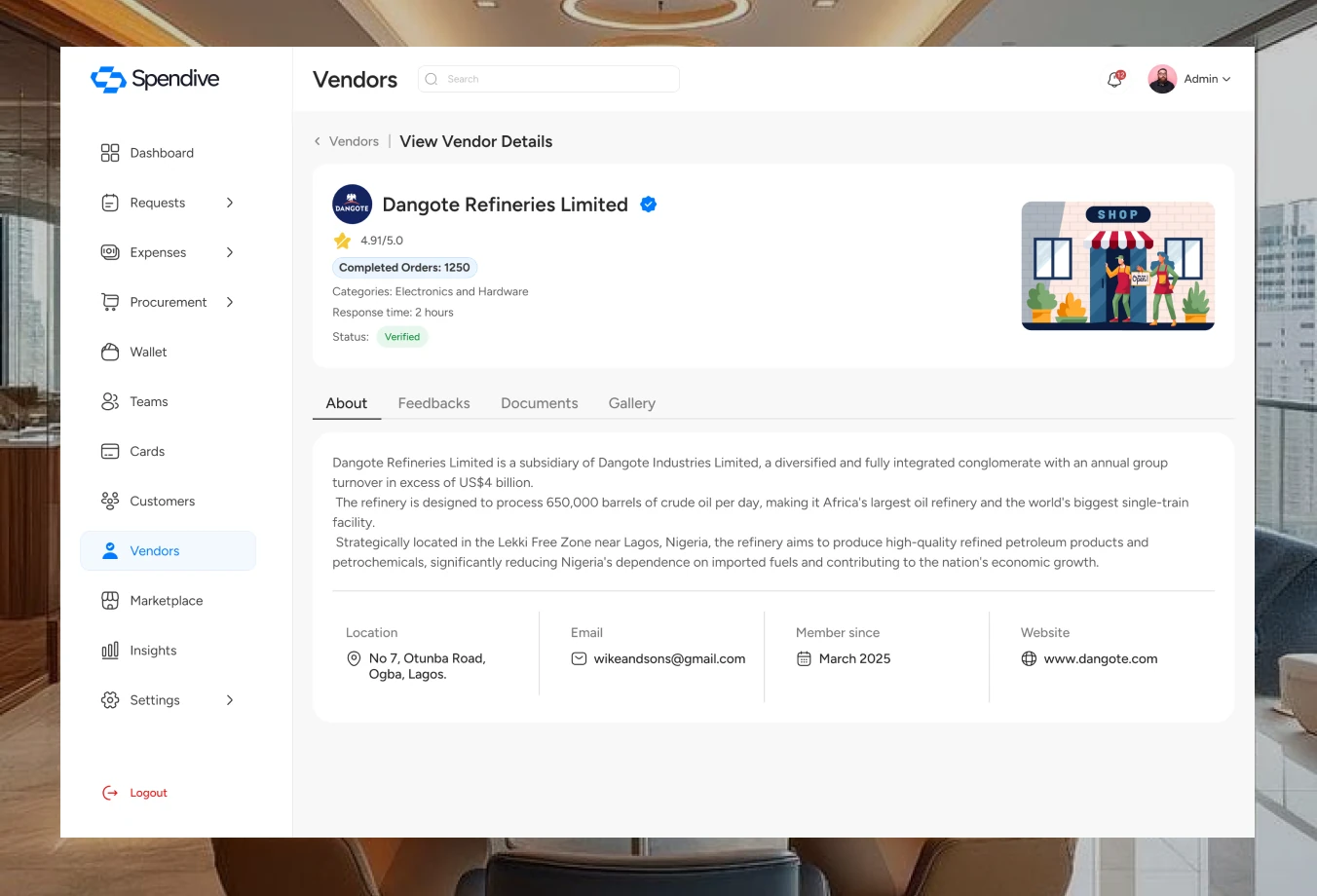
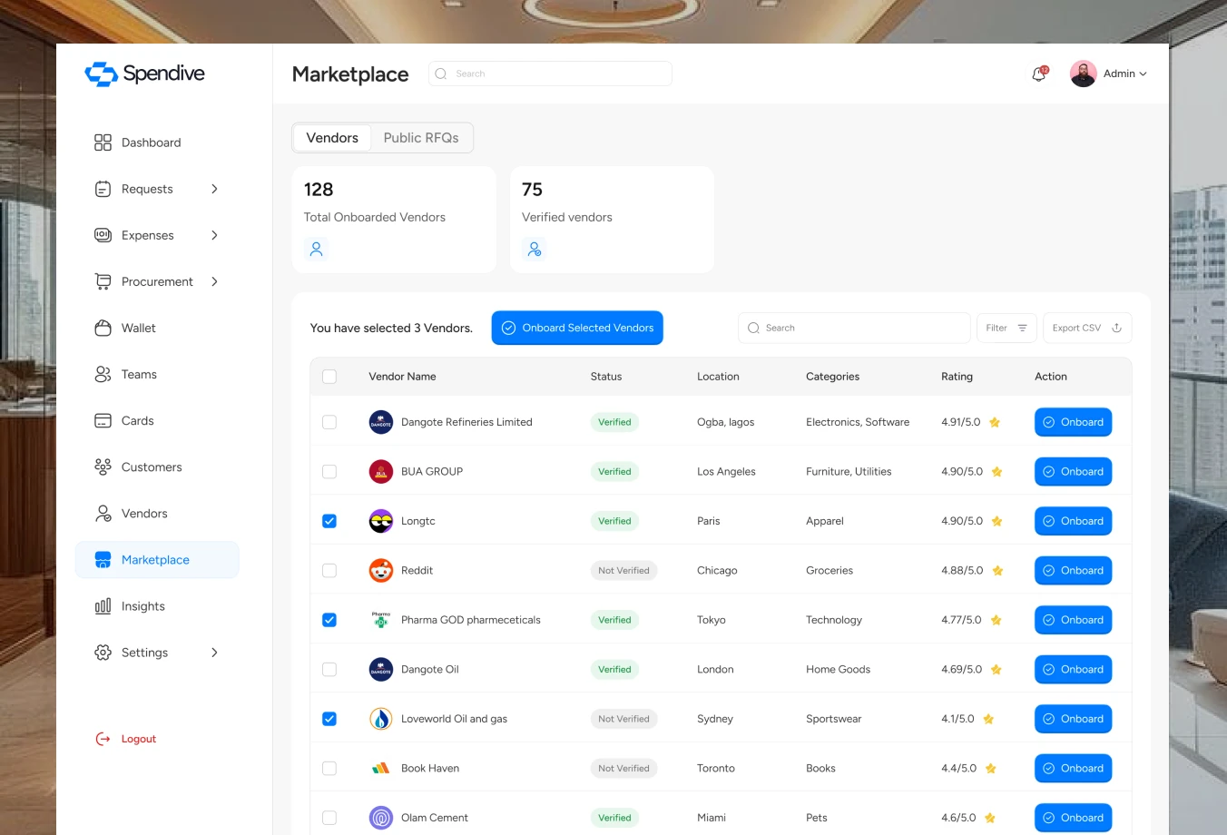
Vendors & marketplace
Vendor profiles bring ratings, orders and documents into one view, and the marketplace helps teams discover and onboard new vendors.
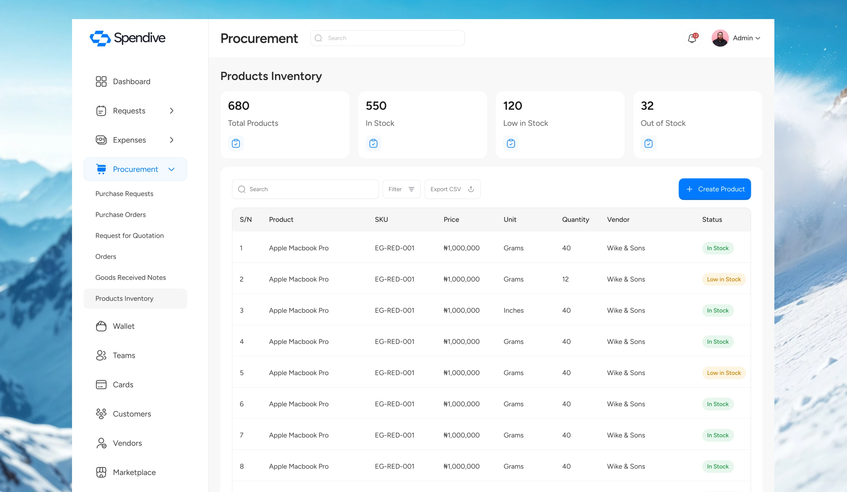
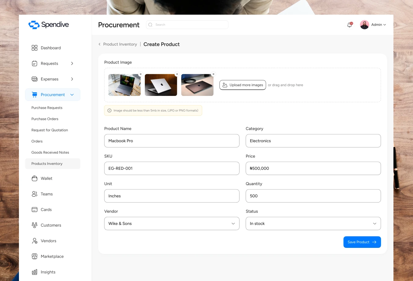
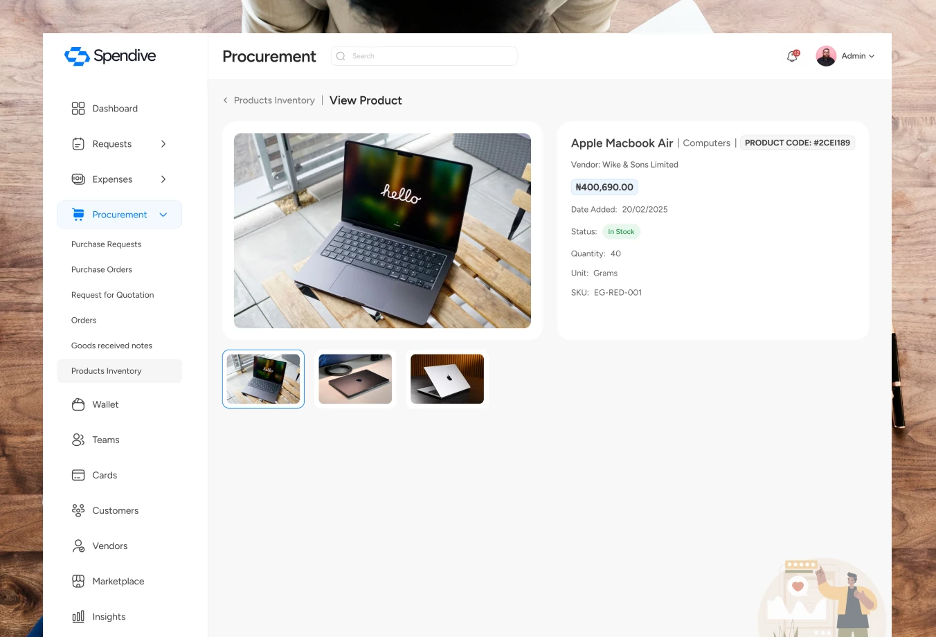
Products & inventory
A product catalogue keeps items, prices and stock consistent across every purchase request.
Marketing website
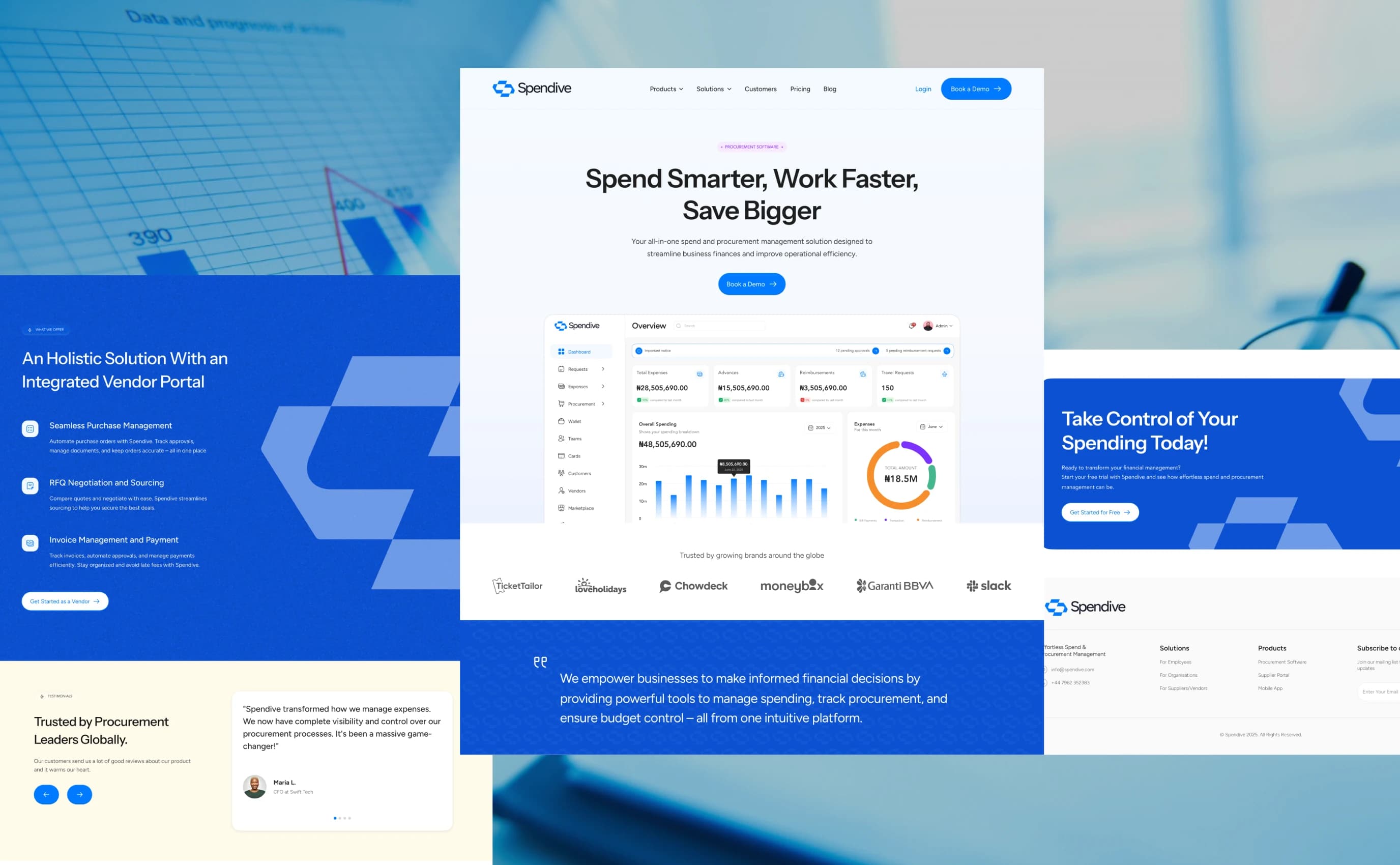
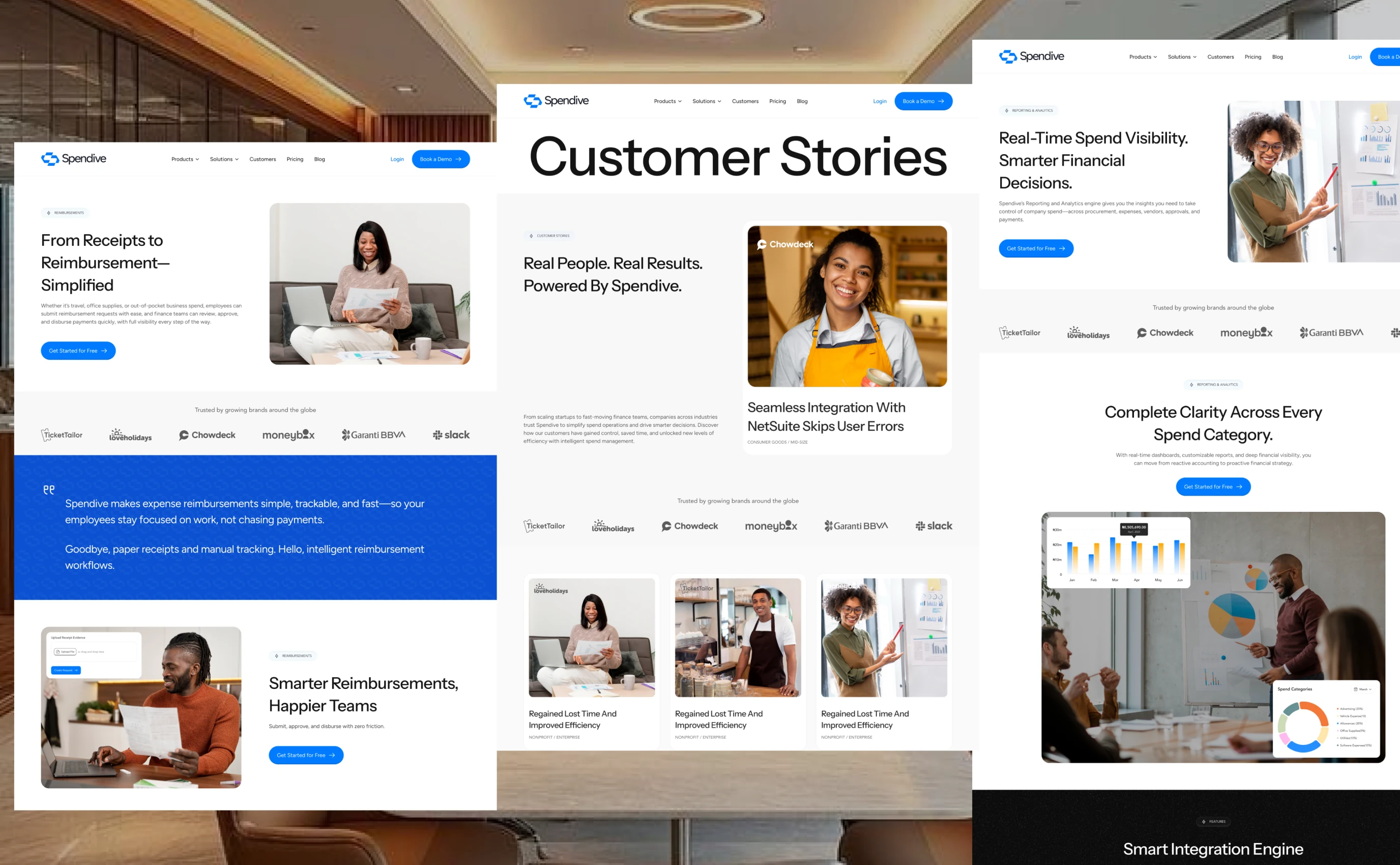
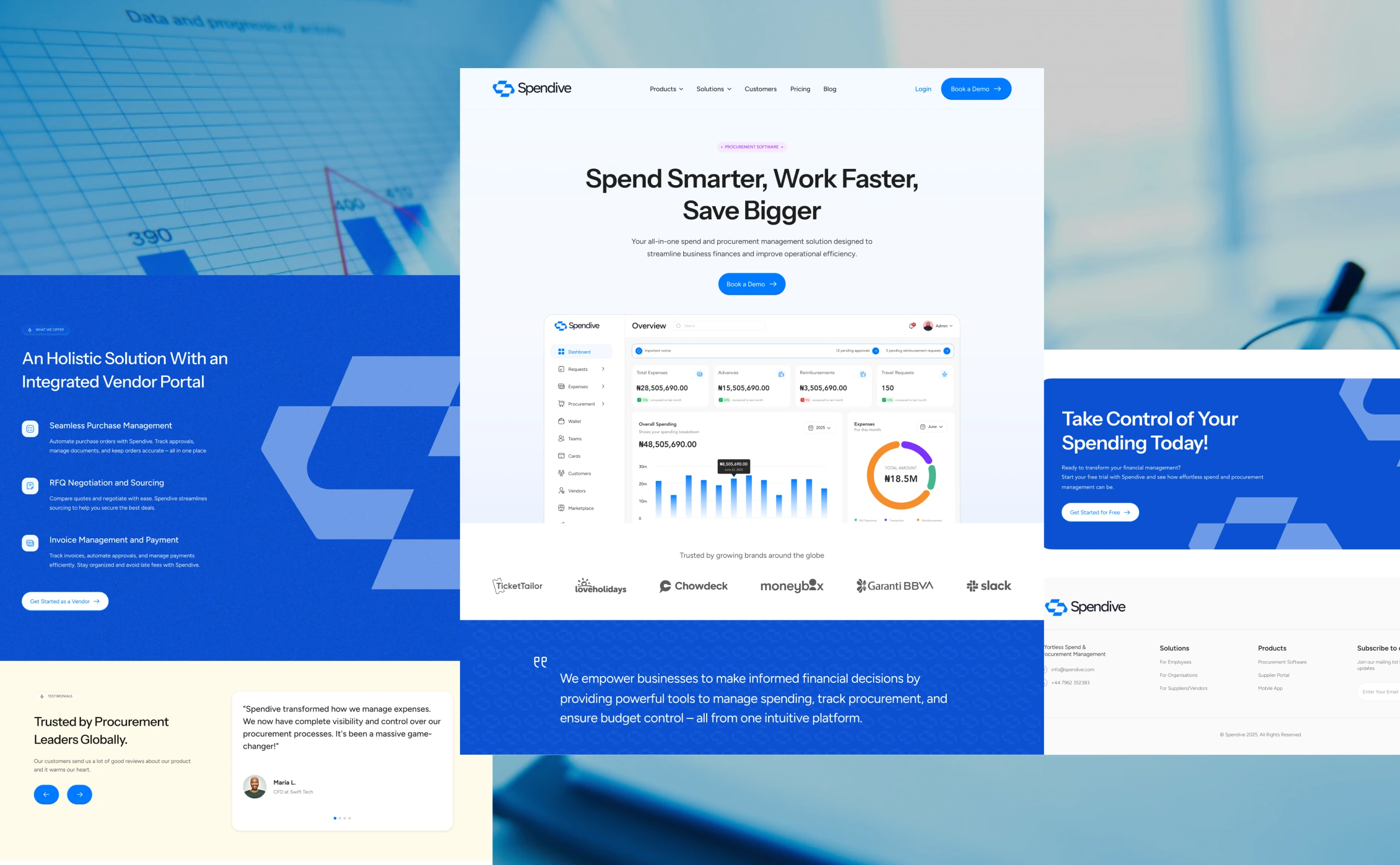
Alongside the product, I designed Spendive’s marketing website. It had to explain a fairly complex platform in seconds, earn the trust of finance teams, and turn visitors into demo bookings, while also bringing vendors onto the platform.
Goals
Communicate the value fast: spend smarter, work faster, save bigger.
Build credibility with finance leaders through real product UI, client logos and testimonials.
Drive one clear action, “Book a demo”, repeated at the right moments down the page.
Design direction
Product-led storytelling: real dashboard, purchase request, vendor and card UI sits inside each feature block, so visitors see the actual product instead of abstract illustrations.
A clear narrative from the hero to the trusted-by logos, key features (expense management, procurement and approvals, vendor management, integrations, insights), the benefits of cost saving, time efficiency, accuracy and collaboration, the integrated vendor portal, testimonials and a final call to action.
Generous white space and a consistent card system keep a feature-heavy page easy to scan.
Impact
We ran usability tests with admins, employees, vendors and customers. Feedback led to simpler forms, status indicators across every approval stage and a mobile experience so approvers can act on the go. Based on the streamlined flows and controls over the course of 6 months, Spendive delivered:
40–50%
faster request-to-approval
Up to 35%
less overspending in 6 months
5–10 hrs
saved per week on manual work
25%
better vendor response & accuracy
30%
higher employee satisfaction
Final thoughts
Designing Spendive was about creating clarity, control and confidence for businesses managing money. From simplifying complex approval structures to enabling quick mobile approvals, every decision balanced user needs with business goals.
Behind the scenes
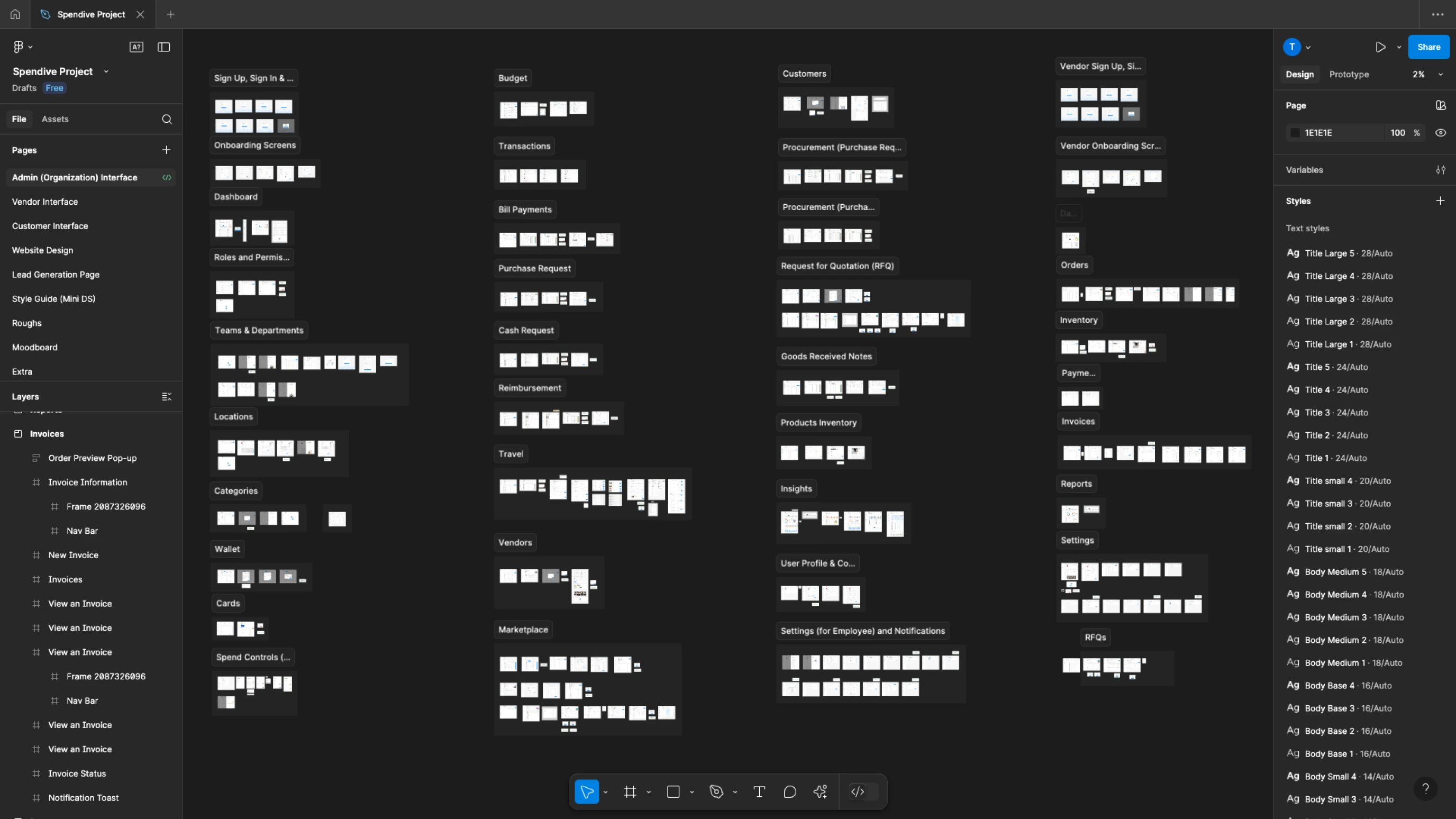
A look inside the Figma file: every interface, flow and component, organised for handoff.