CargoTrace
Freight, in plain sight: shipment tracking for Nigerian importers
Overview
CargoTrace brings every container, delay, document and cost into one calm screen, so importers can stop chasing shipments across WhatsApp, email and phone calls. I designed the full mobile MVP: a 26-component design system, 12 main screens, 8 bottom sheets, four onboarding directions, a shared setup flow and App Store screenshots.
Role
Product Designer, end to end
Type
Mobile app · B2B
Industry
Logistics · Freight
Year
2026
Status
Concept MVP
The challenge
Importers in Nigeria deal with shipping lines, clearing agents and port updates scattered across channels. Delays are normal, but finding out days late is what costs money: demurrage, missed sales, angry customers. Documents live in five places and charges only become clear when the invoice lands. CargoTrace had to turn uncertainty into early, plain-language answers.
The solution
The product is built around one promise: tell people what moved, why, and by how much, before it becomes a problem.
A home that shows what is in transit, at customs and delivered at a glance
Live vessel tracking with ETA, route progress and AIS freshness
Delays explained in plain language, with the new ETA and what to do
Documents and costs attached to every shipment, not lost in inboxes
Onboarding exploration
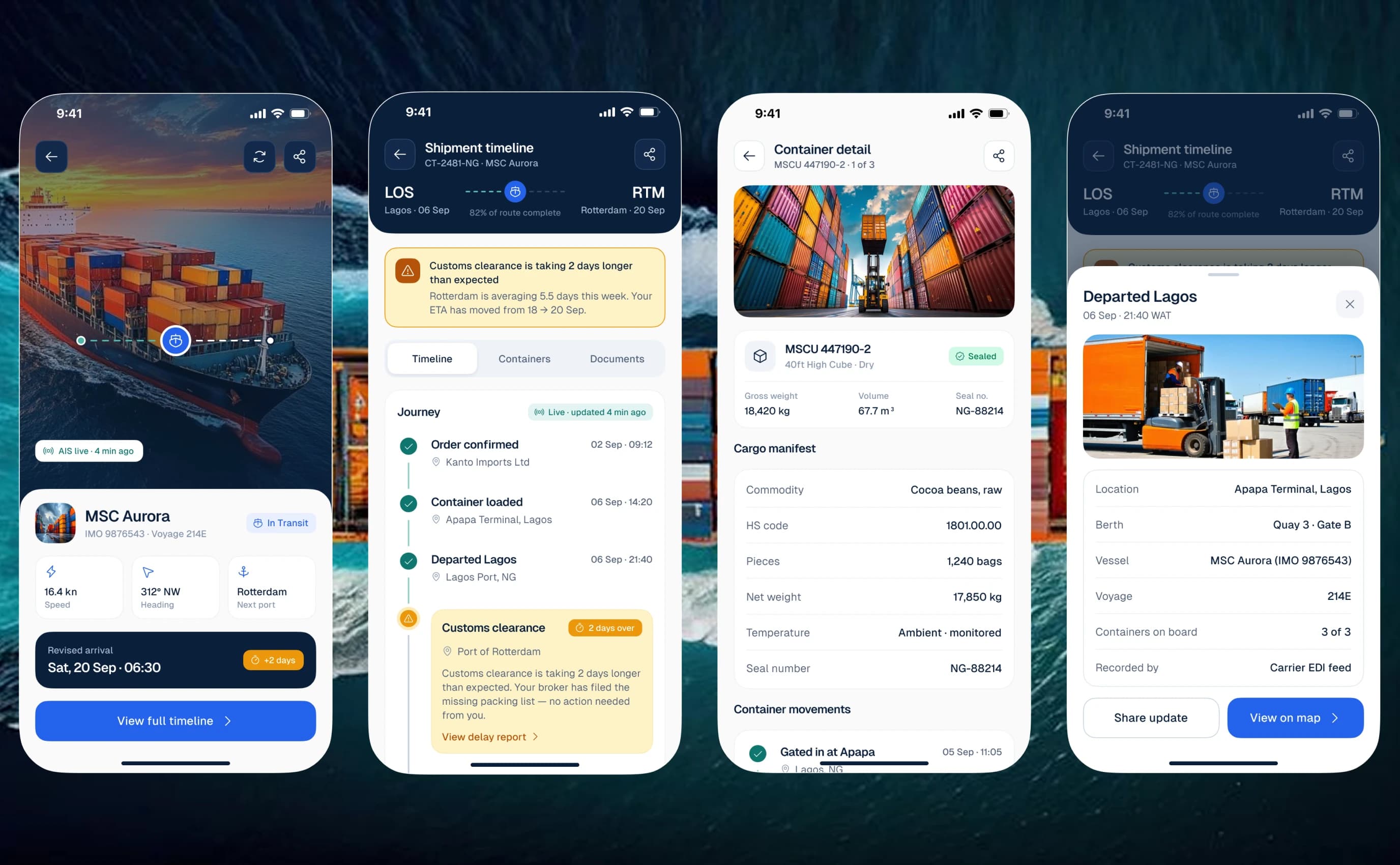
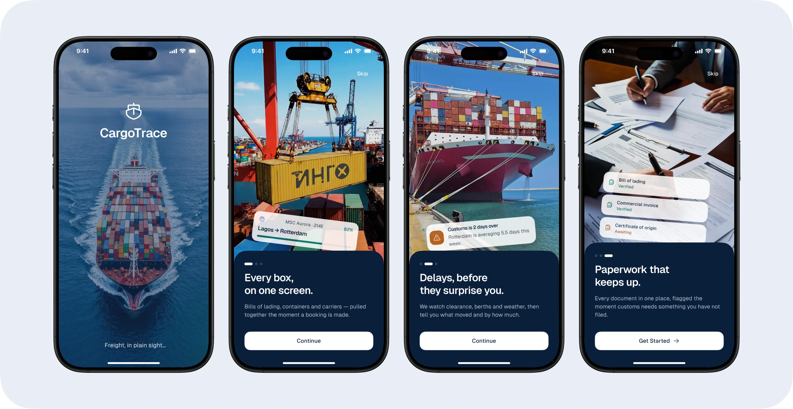
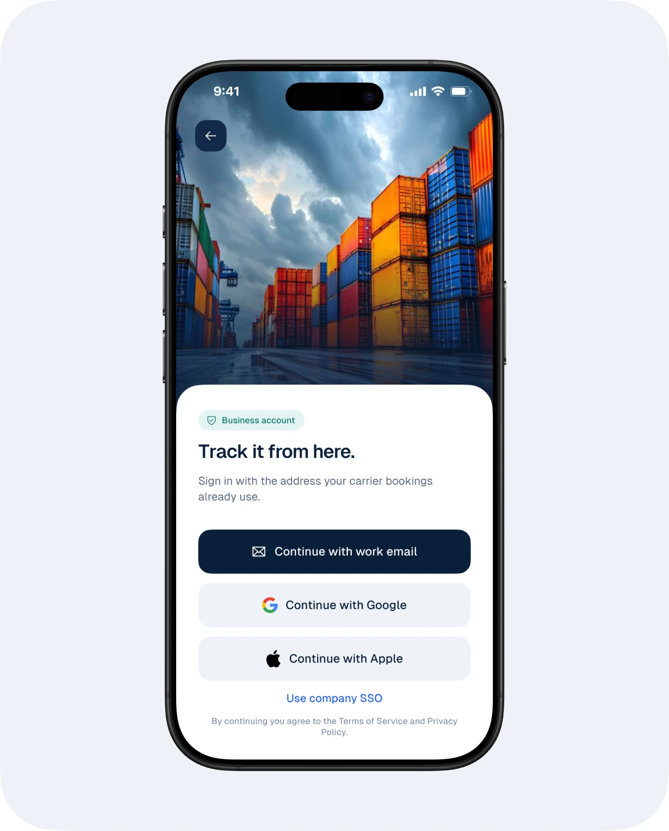
I explored four onboarding directions before choosing the one that leads with value instead of features. The final flow promises three things in the user’s own words.
“Every box, on one screen.” “Delays, before they surprise you.” “Paperwork that keeps up.”
Full-bleed port photography makes the product feel tangible from the first screen.
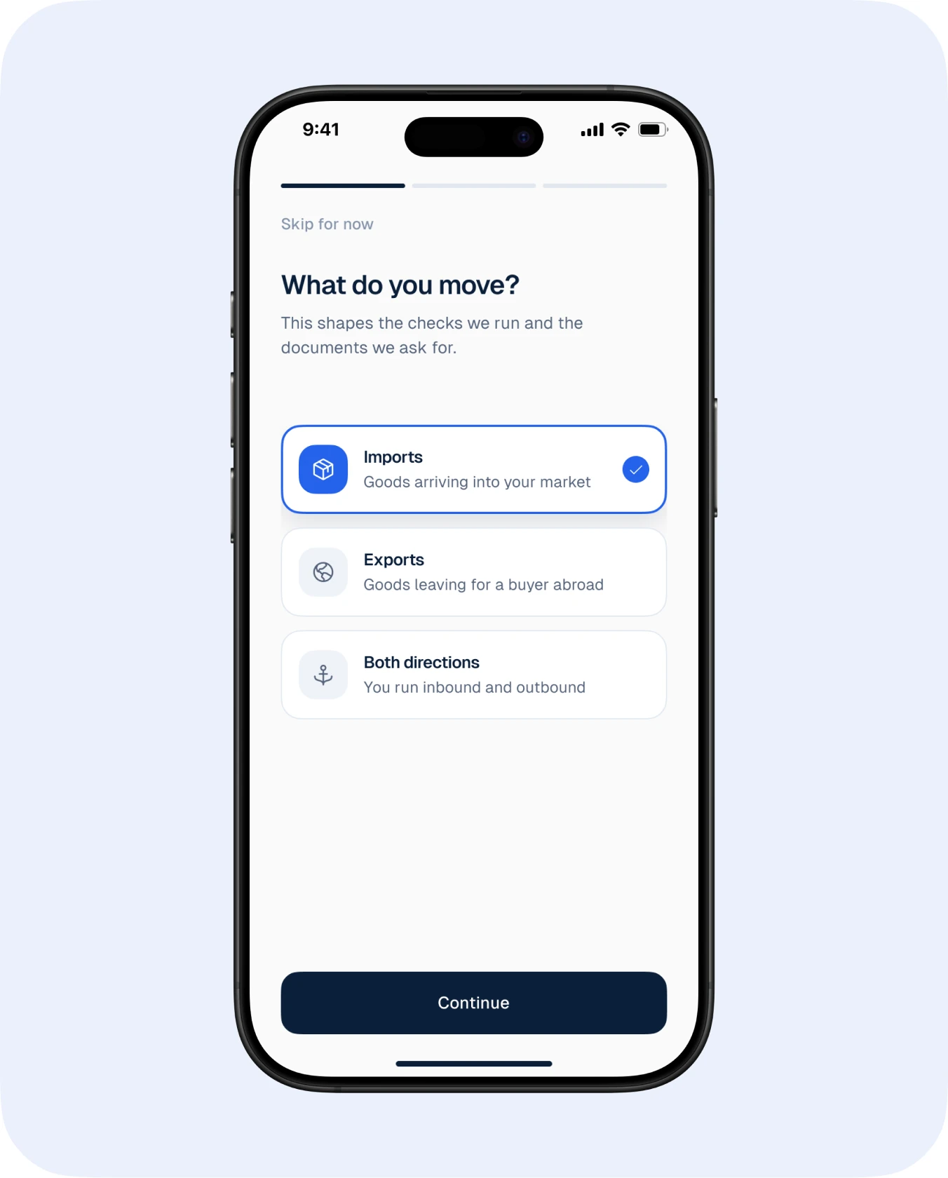
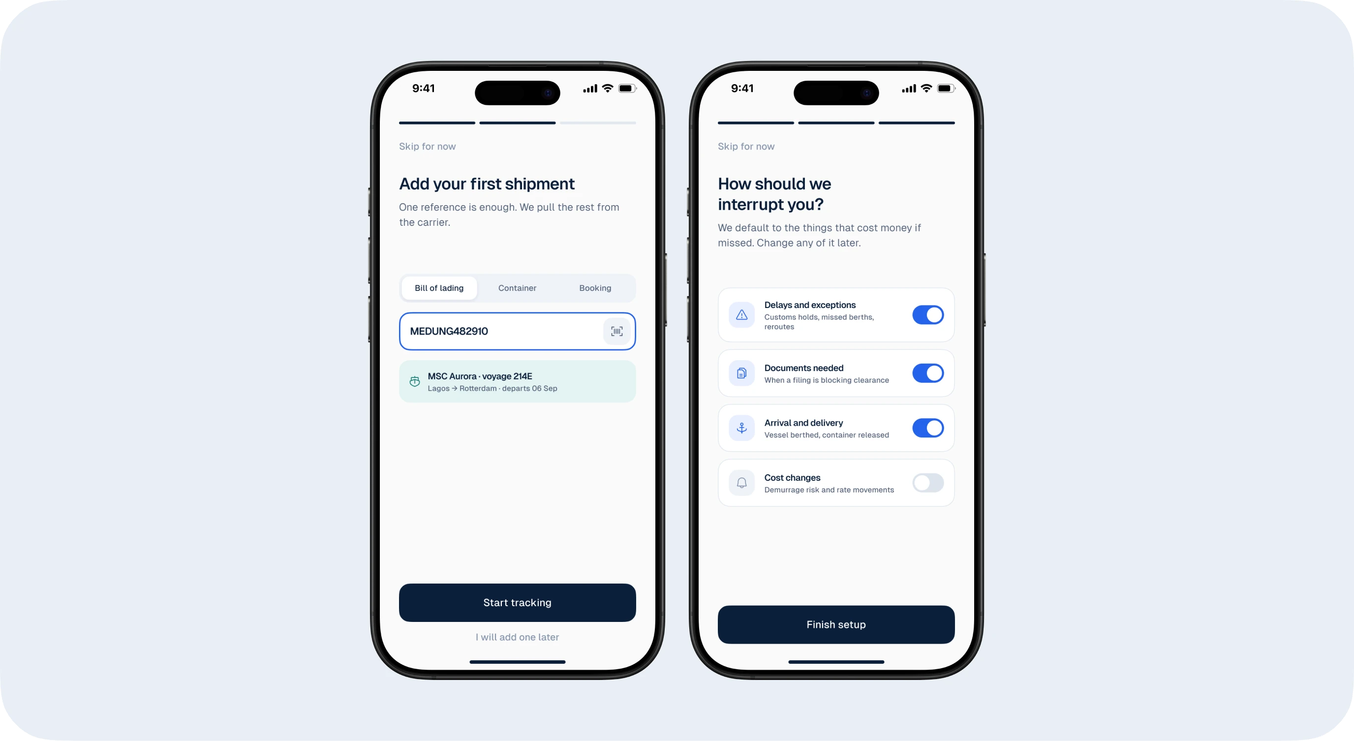
A shared post-auth setup asks what you move, adds a first shipment and sets how you want to be interrupted.
Post-auth setup
Before the home screen, three quick questions shape what CargoTrace pays attention to.
“What do you move?” tailors defaults to the importer’s cargo.
Adding a first shipment means the home screen is never empty.
“How should we interrupt you?” lets people choose which alerts deserve a push notification.
Home & shipments
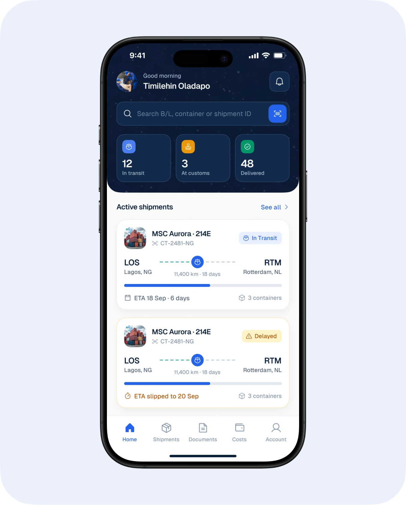
The home screen leads with counts (in transit, at customs, delivered), then active shipments with route progress and ETA.
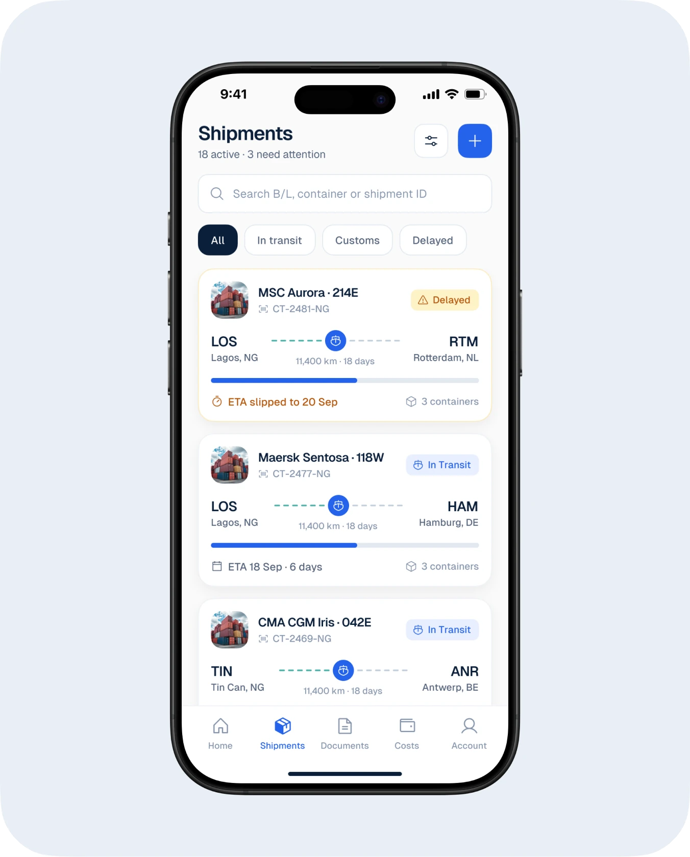
Delayed shipments are flagged in amber with the slipped ETA, so problems surface first.
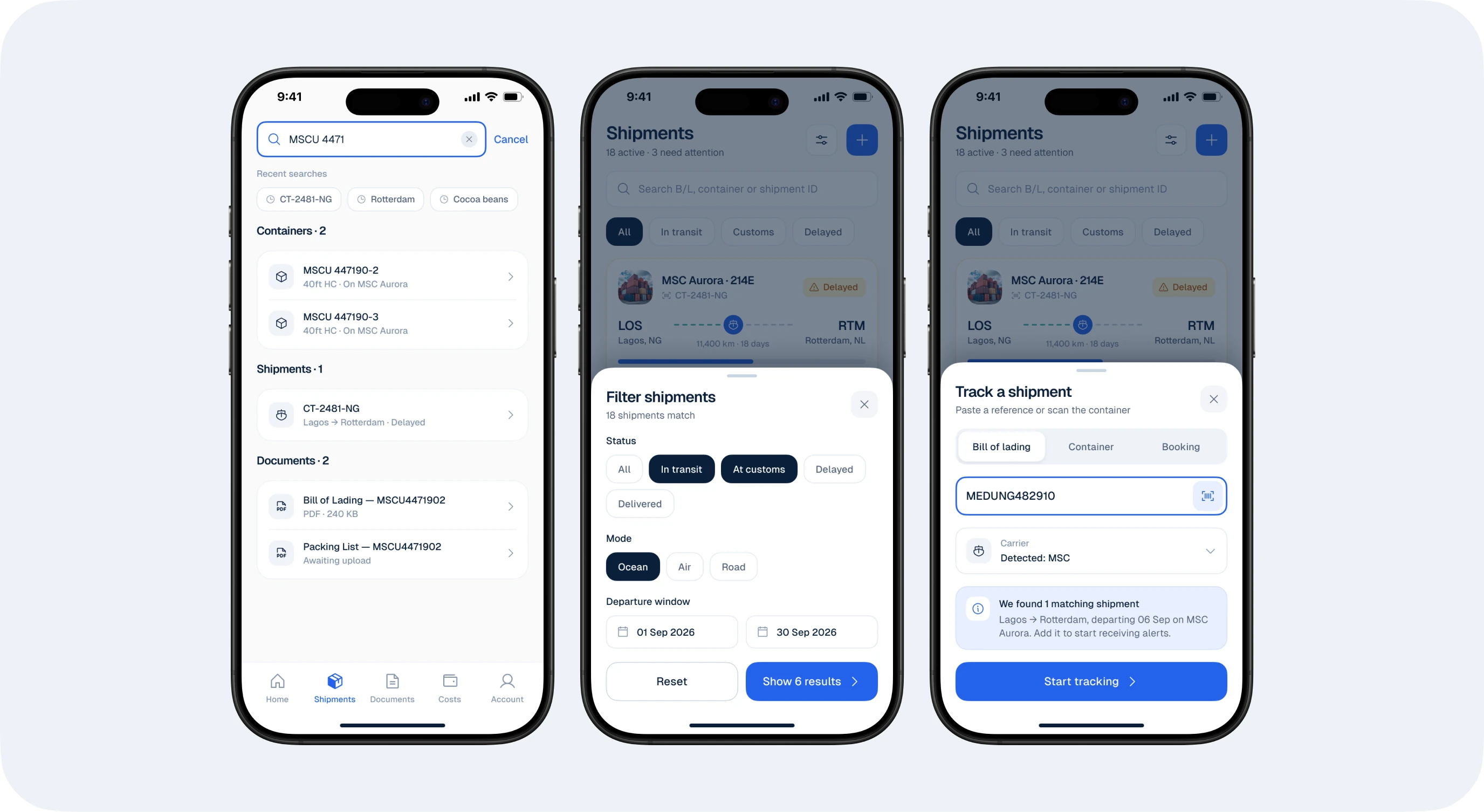
Search accepts a bill of lading, container or shipment ID, matching how importers already reference cargo.
The shipments list filters by status: all, in transit, customs, delayed.
Tracking & timeline
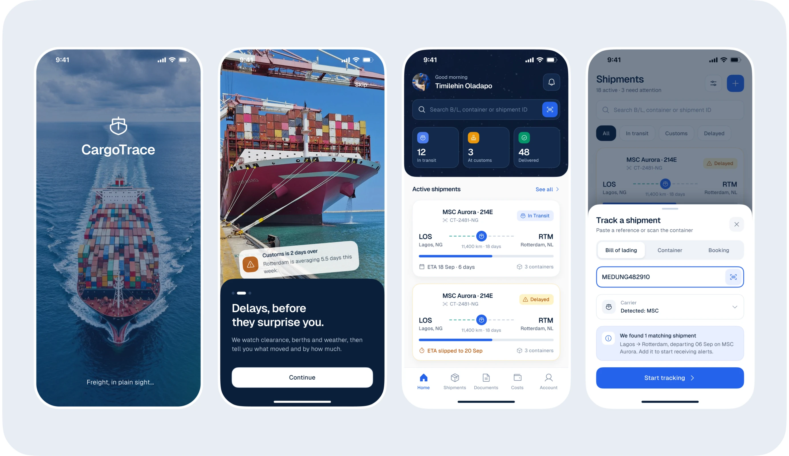
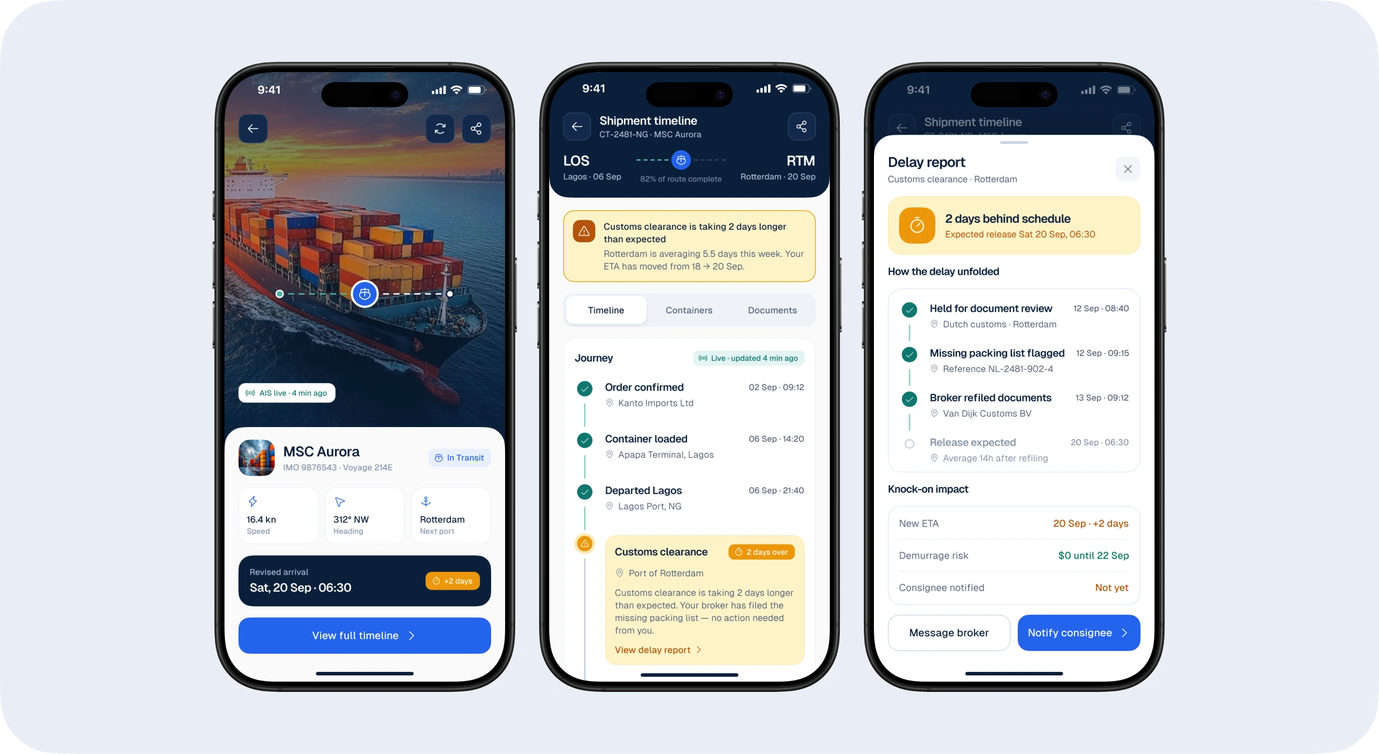
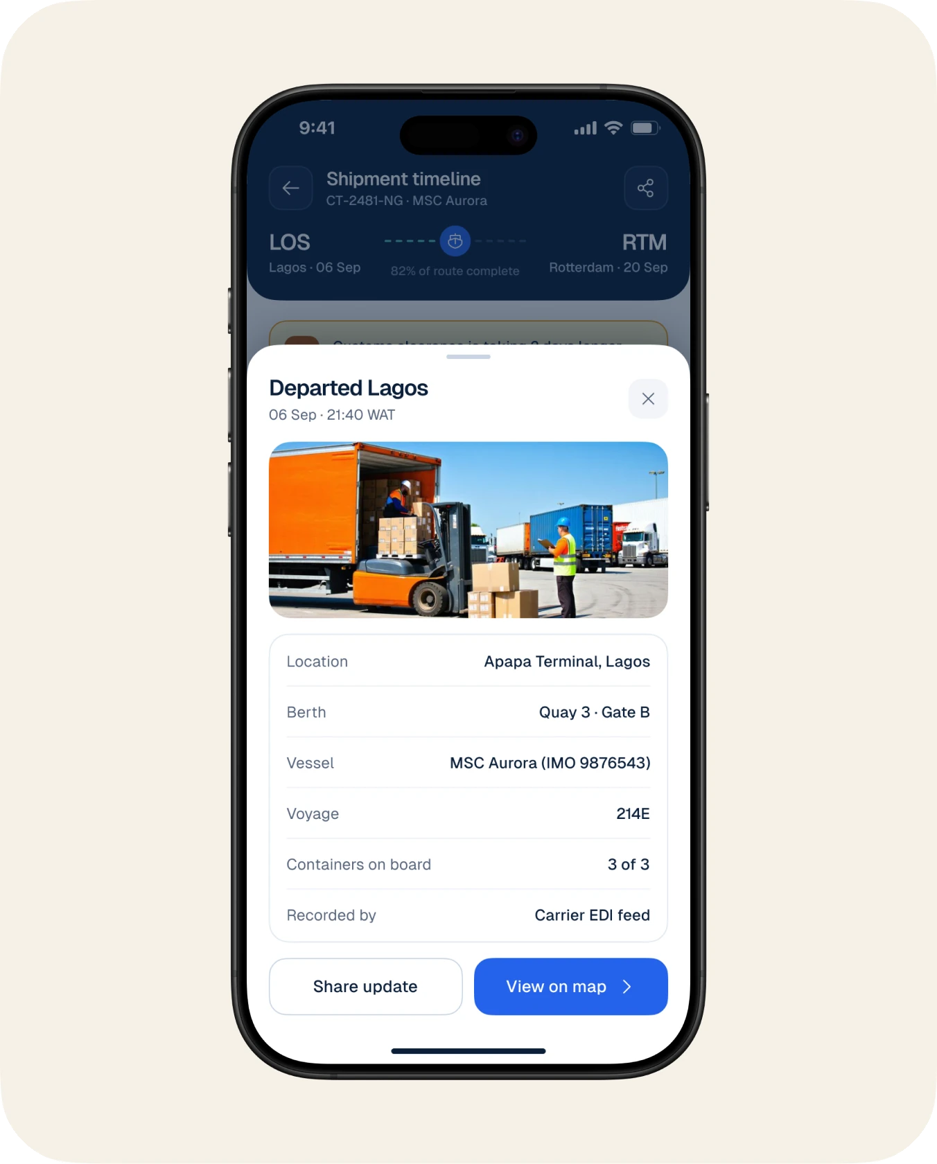
Tracking shows the live vessel position, speed, heading and next port, then a timeline of every milestone.
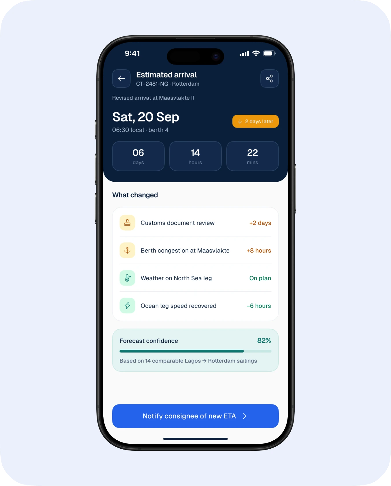
Delays become a readable story: “Customs clearance is taking 2 days longer than expected,” with the new ETA.
Each milestone opens a bottom sheet with location, berth, vessel and who recorded it.
A delay report explains the cause and whether any action is needed, often none.
Container detail & paperwork
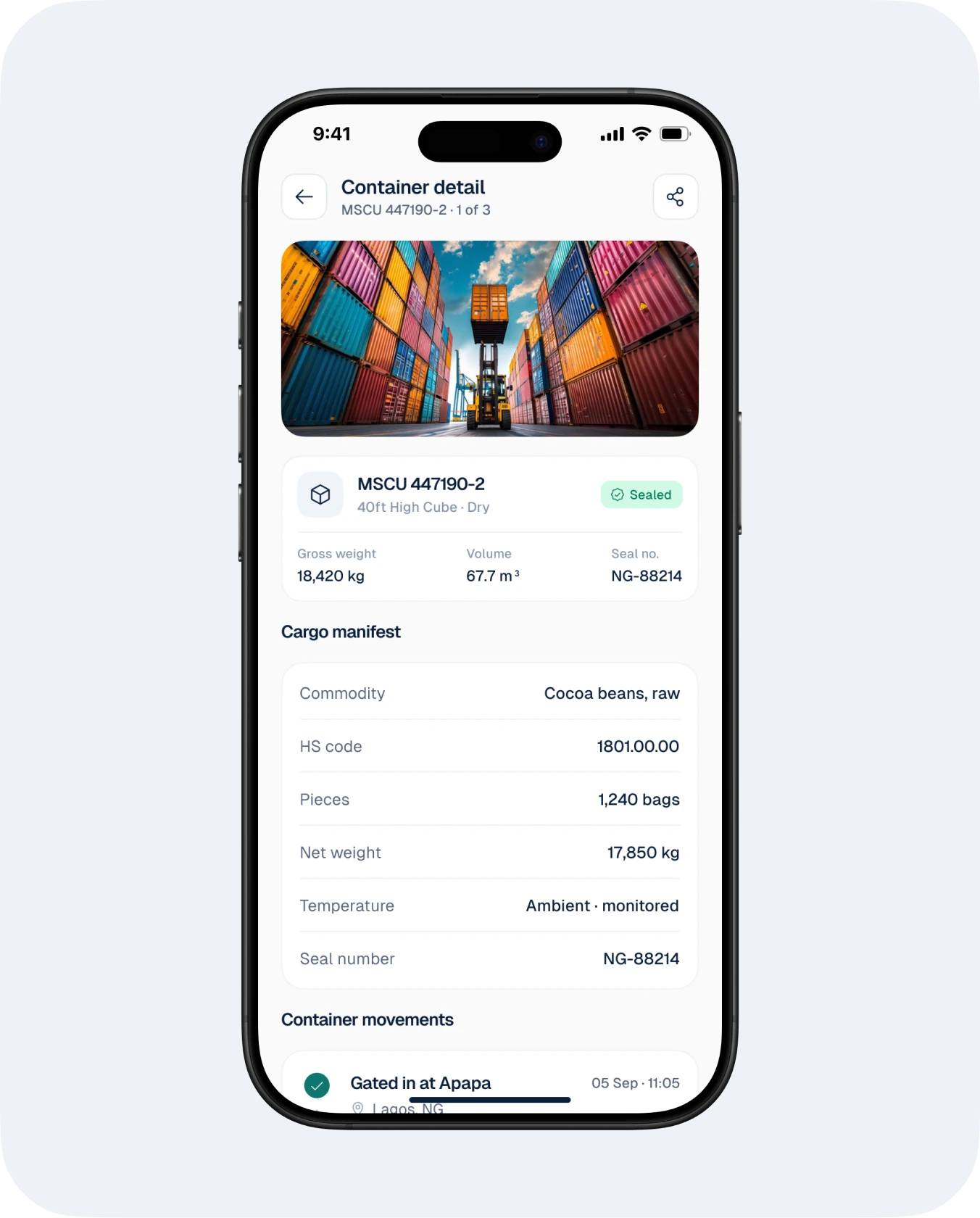
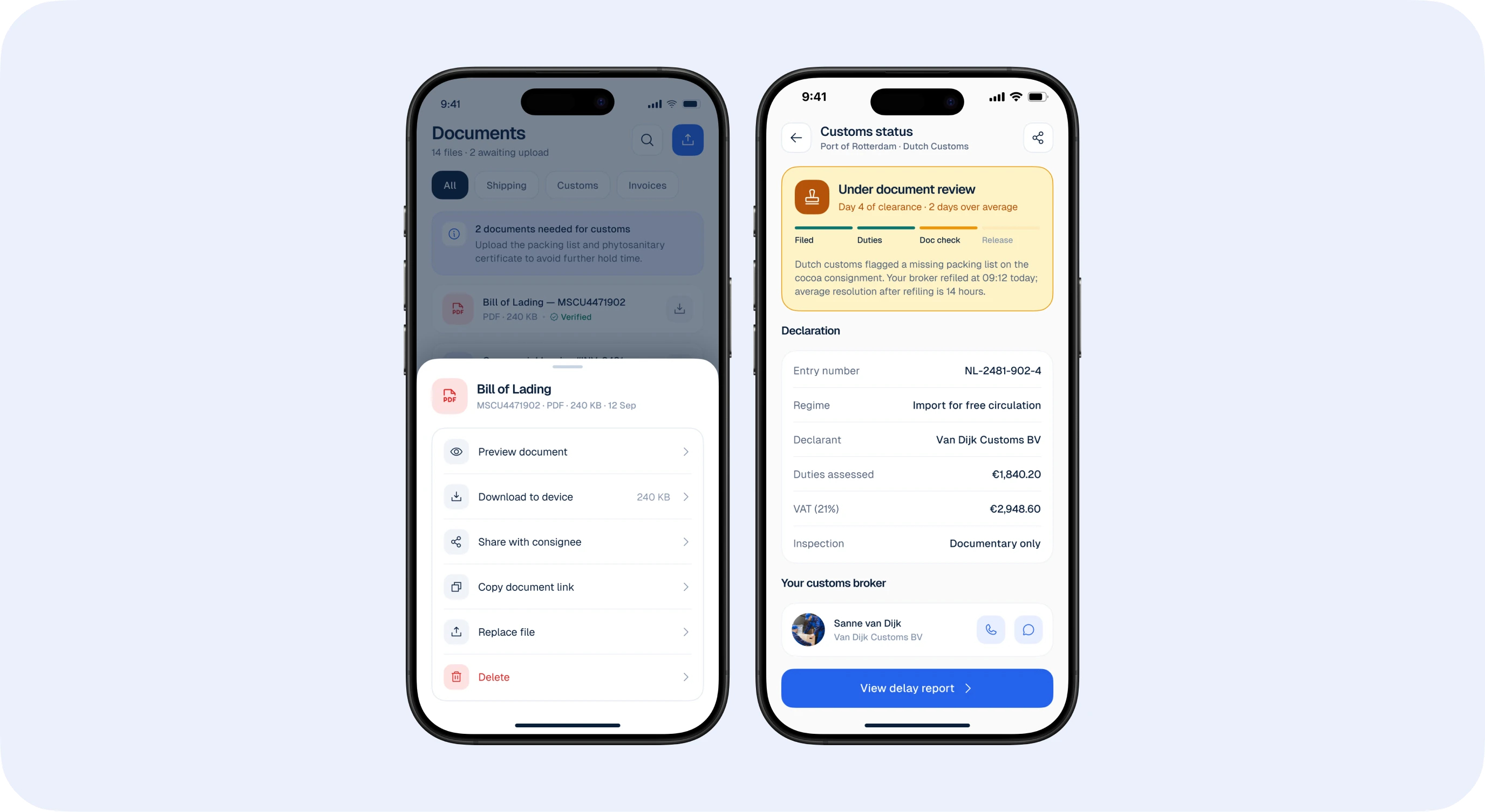
Everything about a container lives with the shipment: manifest, documents, customs status and estimated arrival.
Cargo manifest shows commodity, HS code, weights and seal number at a glance.
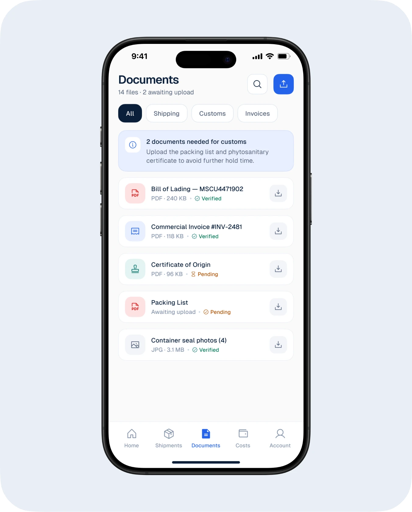
Documents show what is ready, pending or missing, with actions in one tap.
Customs status uses the same timeline language, so nothing needs re-learning.
Costs, alerts & sharing
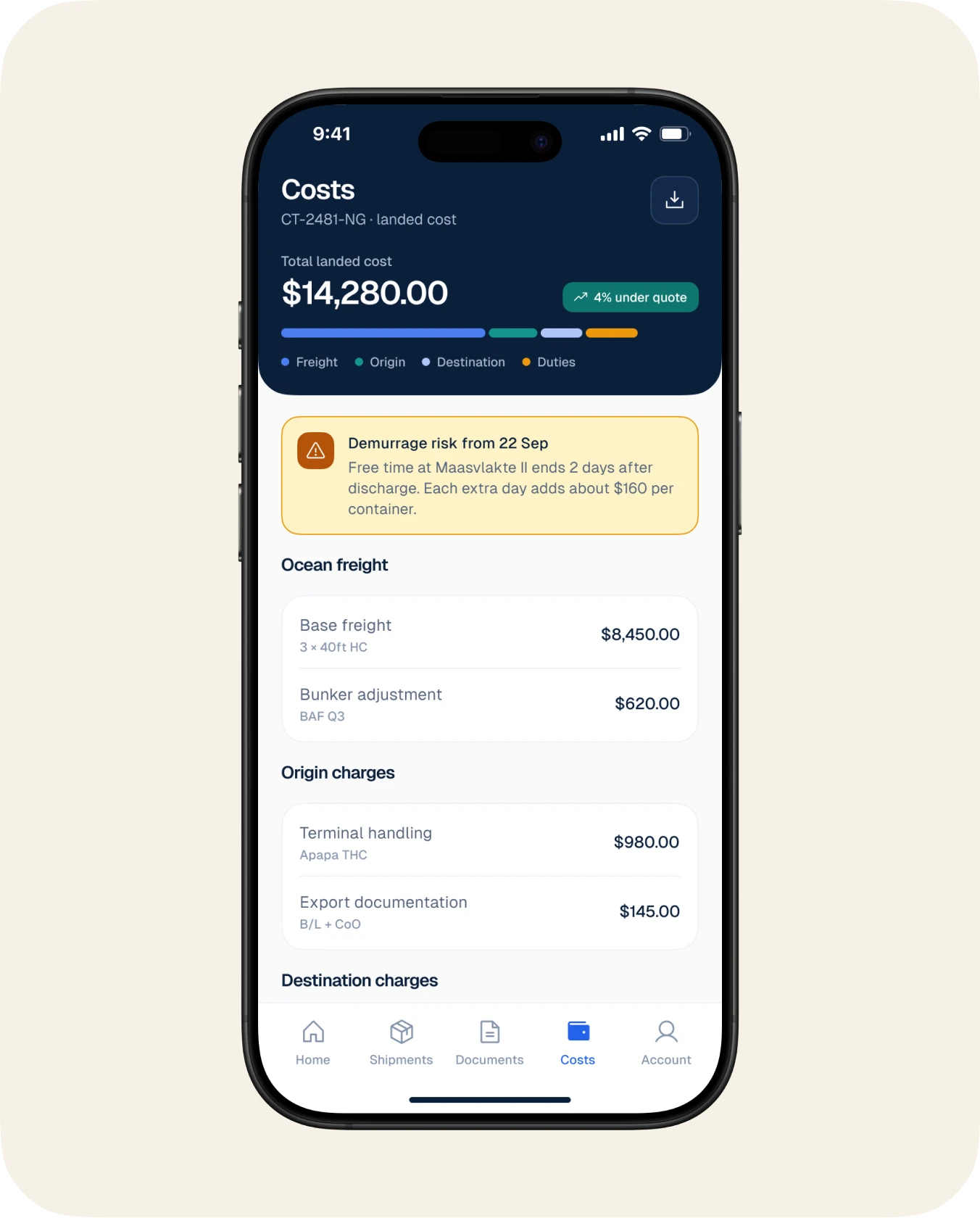
Charges and alerts are designed to be predictable: you see costs build up before the invoice and get alerts only for what you asked.
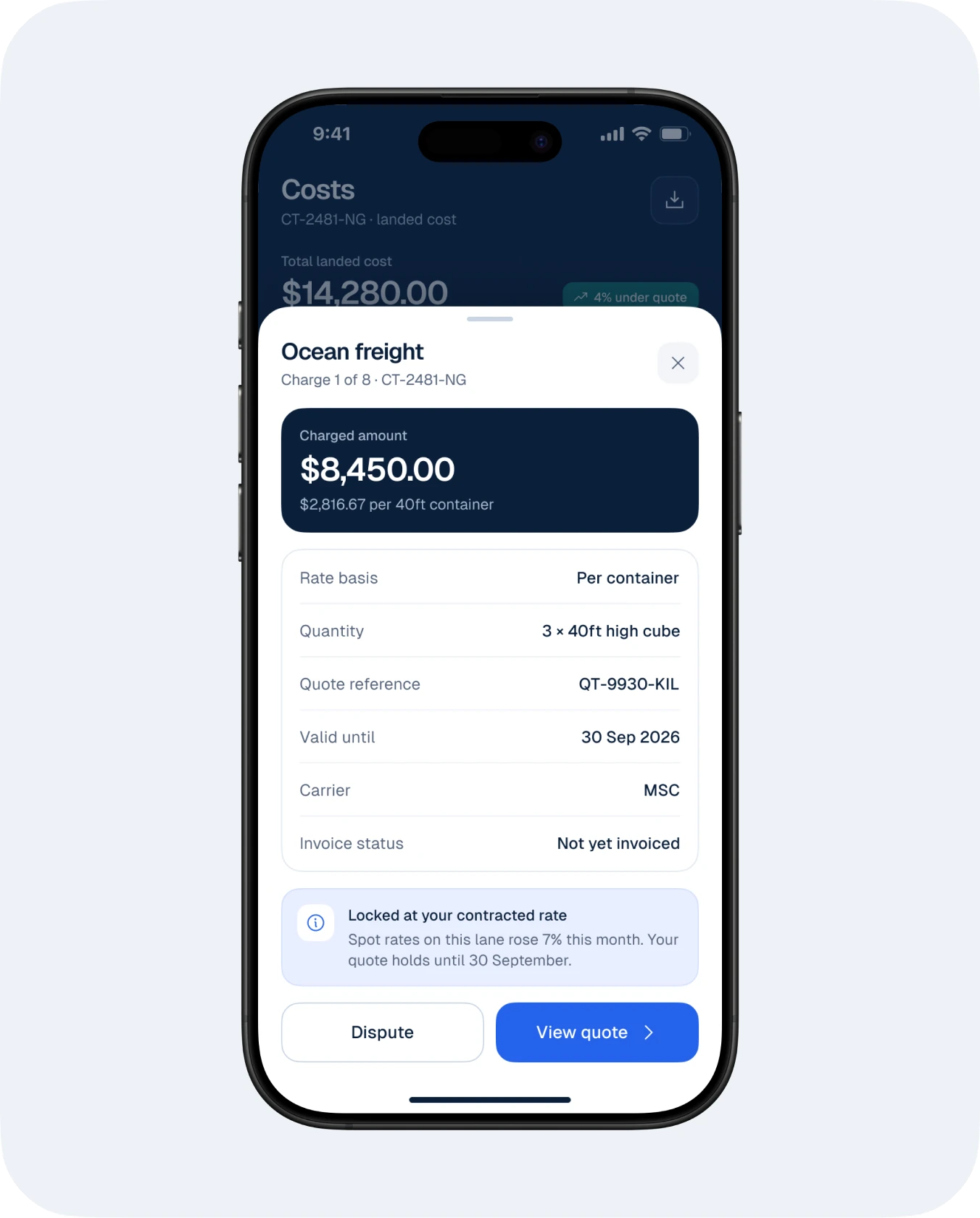
Costs are broken down per shipment, with each charge explained in a detail sheet.
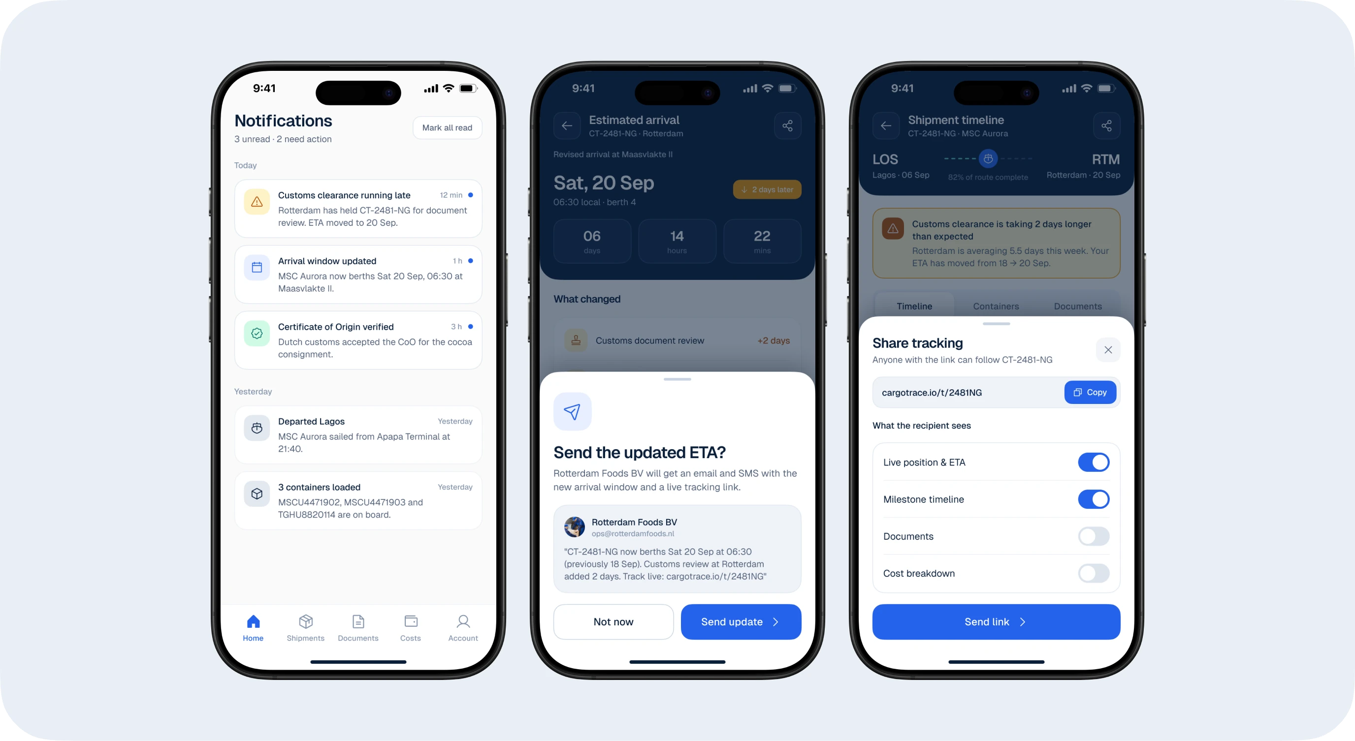
Alerts are grouped by shipment and severity, never a noisy feed.
Share tracking sends a clean update to a consignee or customer in one step.
App Store screenshots
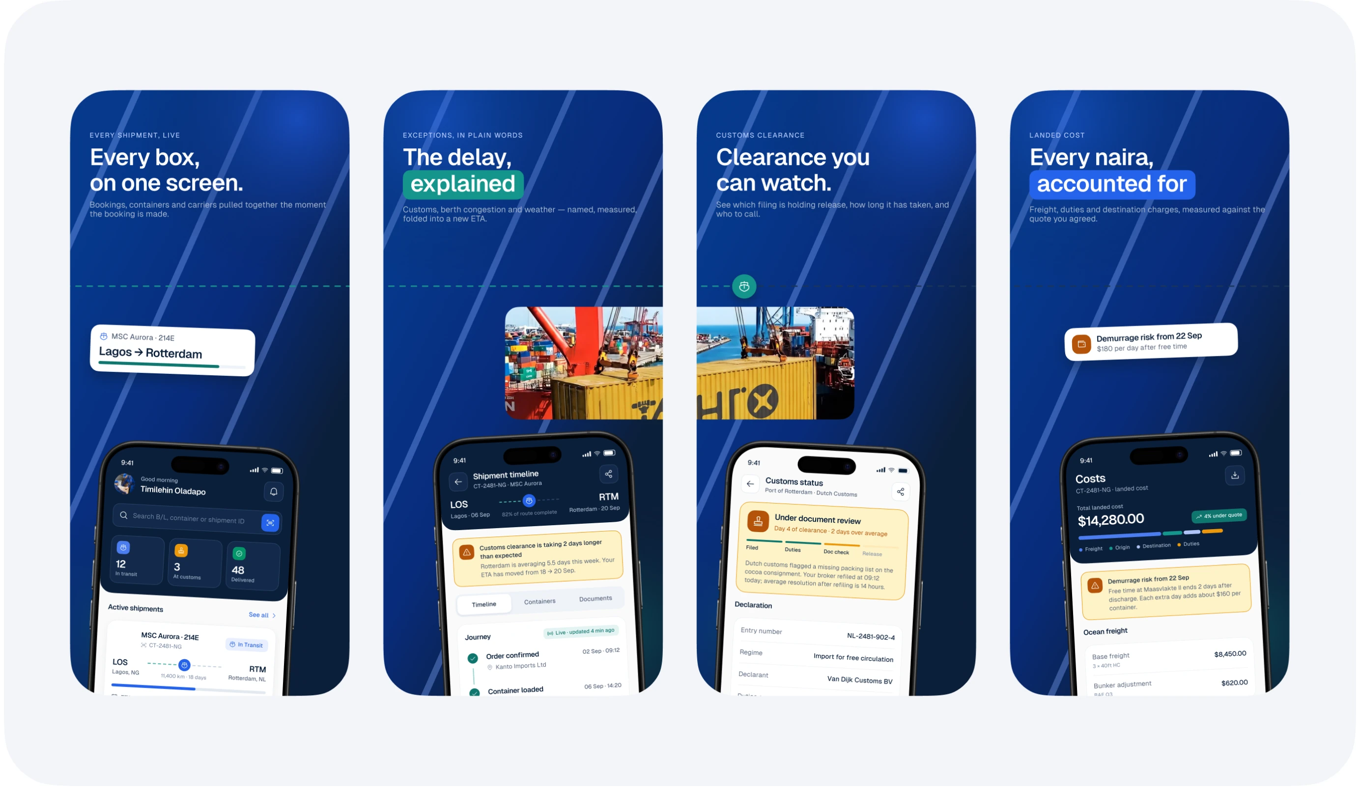
Three versions were explored. The final set leads with the outcome in each frame, “Every box, on one screen” and “The delay, explained”, paired with real UI so the store page sells the experience honestly.
Outcome
The outcome
CargoTrace was delivered as a complete mobile MVP with a reusable 26-component design system, 12 main screens, 8 bottom sheets, four explored onboarding directions and three App Store screenshot versions, ready for a development team to build from directly.